Client
Year
2017
Role
- UX/UI Designer freelance
What we did
- UX Strategy
- User flows
- Wireframing
- Final UI
Link
Simplify the book publishing process.
Most writers struggle to show their work to the public as the main Publishing Companies tend to own most of the publishing market.
Cuvify wants to solve this problem, allowing anyone to publish their books via an online library.
Limitations
Working with an early staged startup, with limited time and limited resources, also considering that the developer team was small so the request was to be simpler as possible.
How we approached
the project
After collecting the concept and the idea from the two founders of the startup and being new to the E-book world I did some benchmark, mainly on the Apple Bookstore and Amazon Kindle, analyzing stronger points and their best practices. I’ve also done some research on minor platforms and similar products.
We set up weekly touchpoints since the early phase of the project due to the limited time we had to design the whole process and to make sure all the team was constantly aligned.
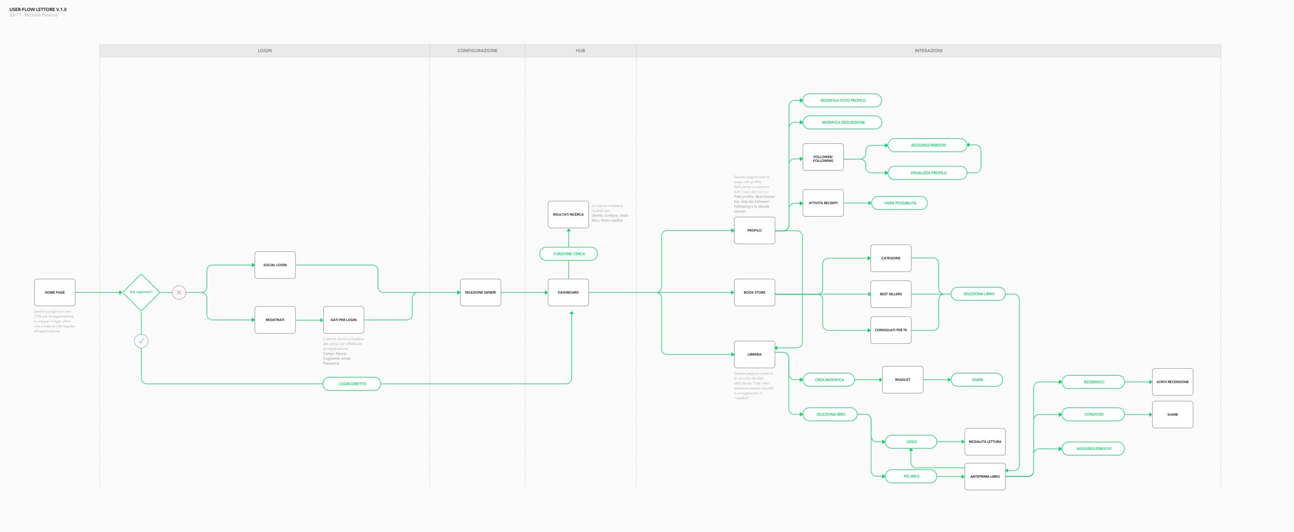
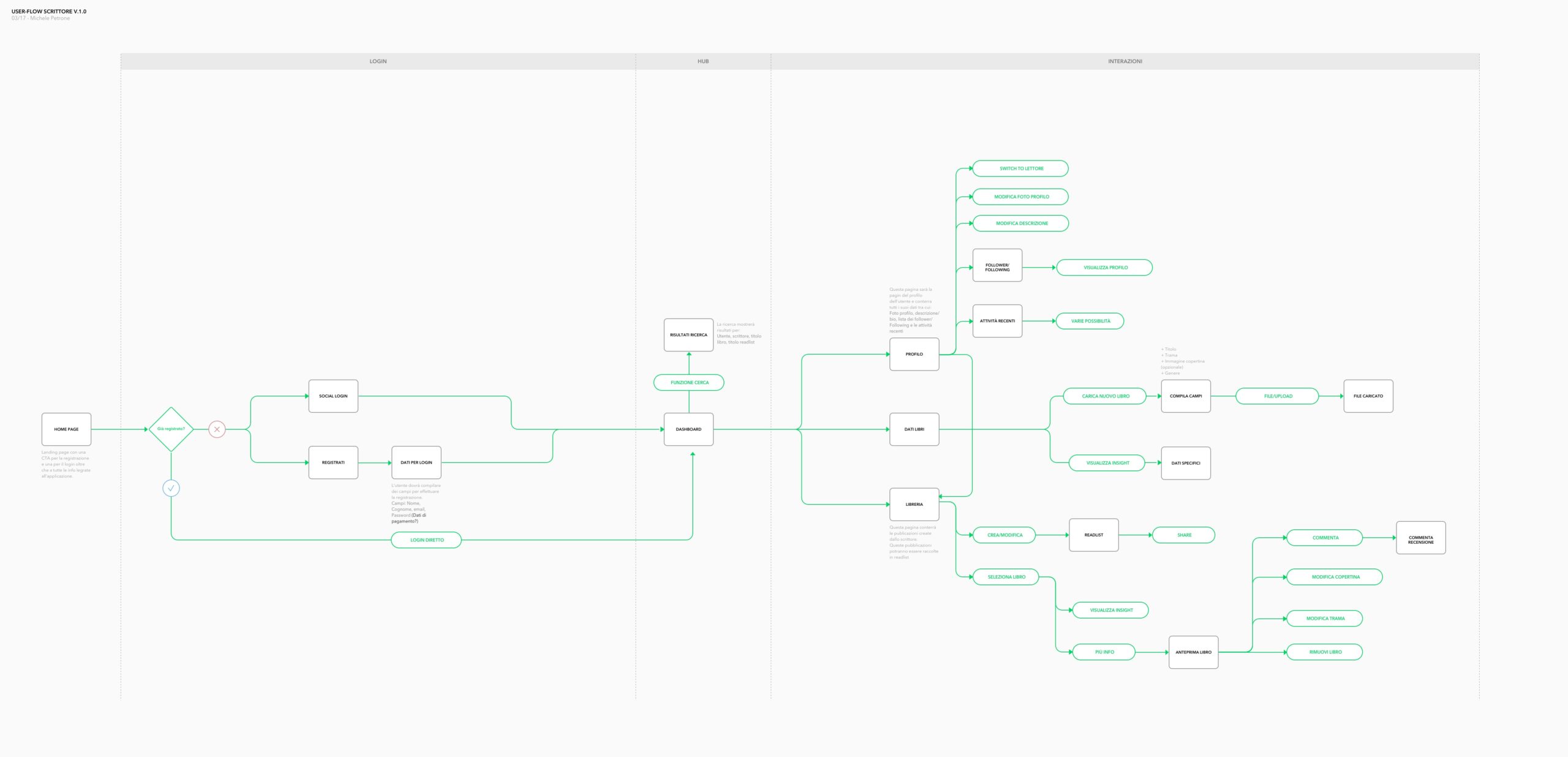
Information Architecture definition and then the creation of user flows were the starting point of the project.
This process permits us (Ux + devs) to define all the functionalities to develop and the stories explore in detail for each functionality.
Information Architecture
& User flows
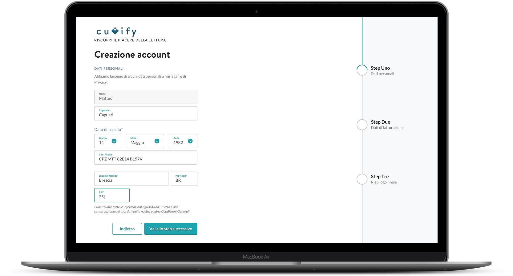
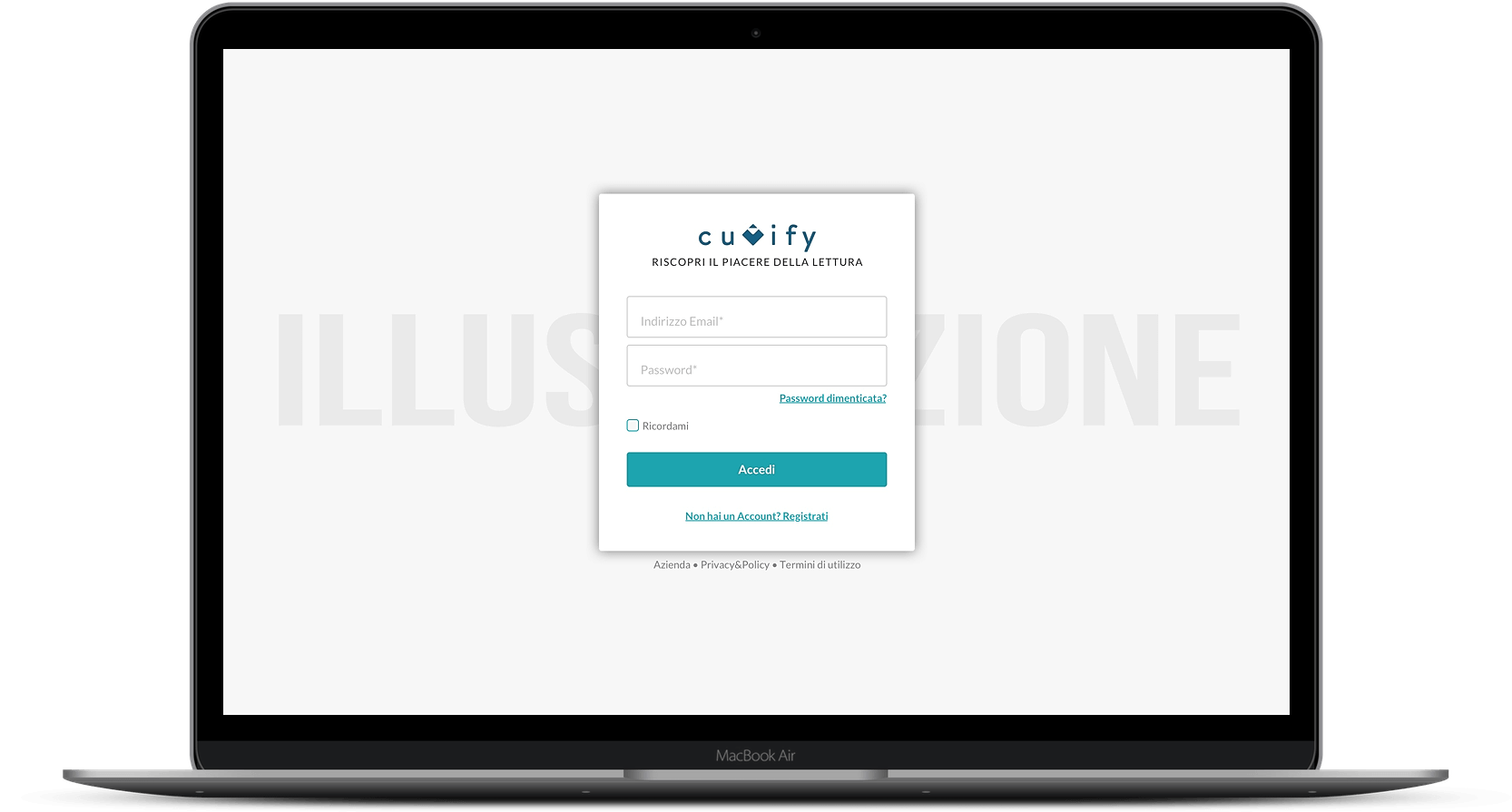
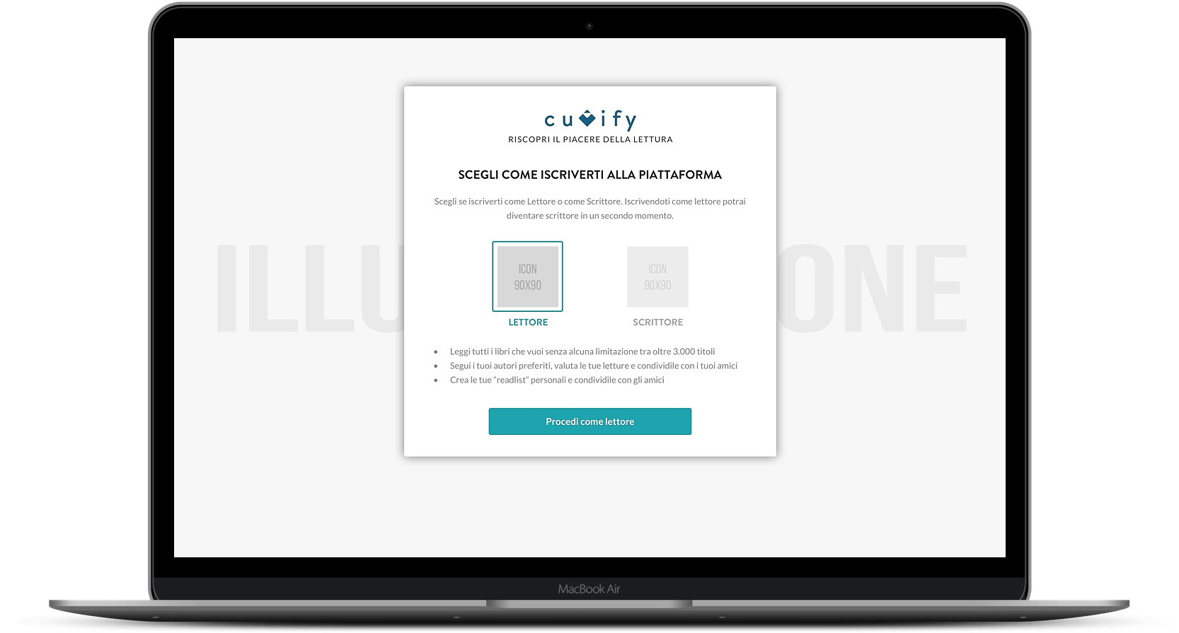
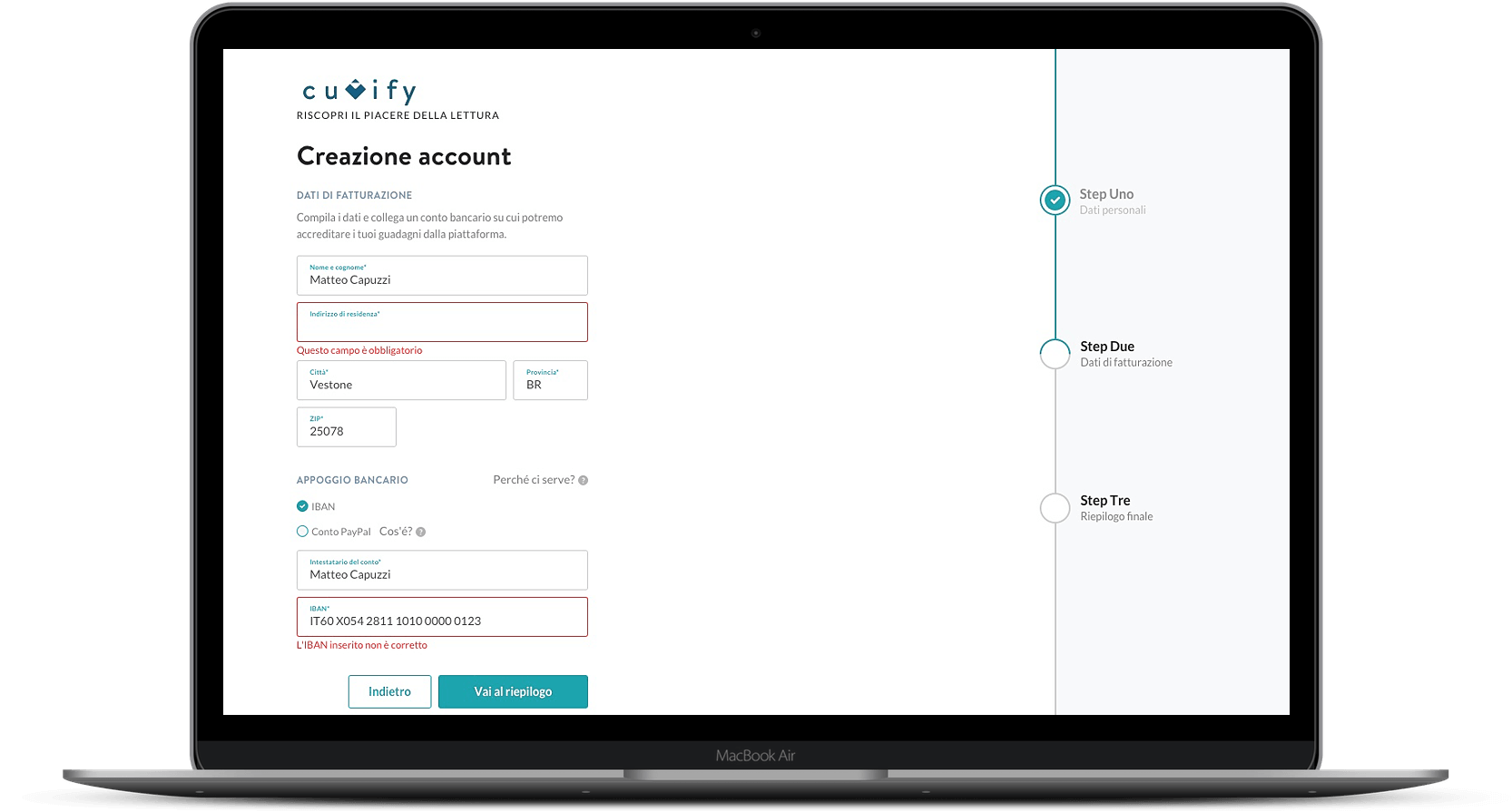
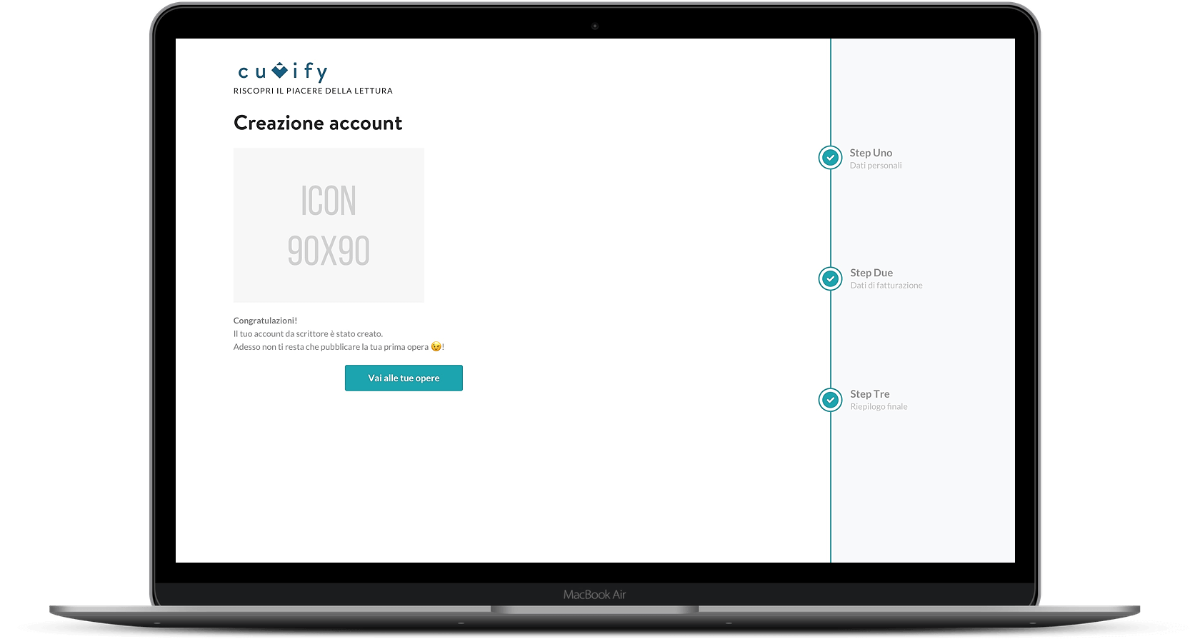
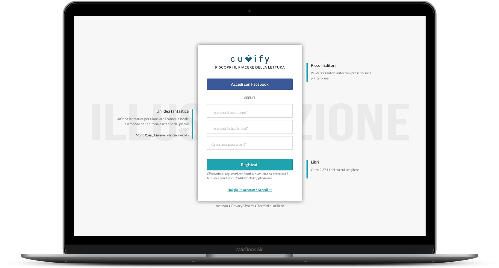
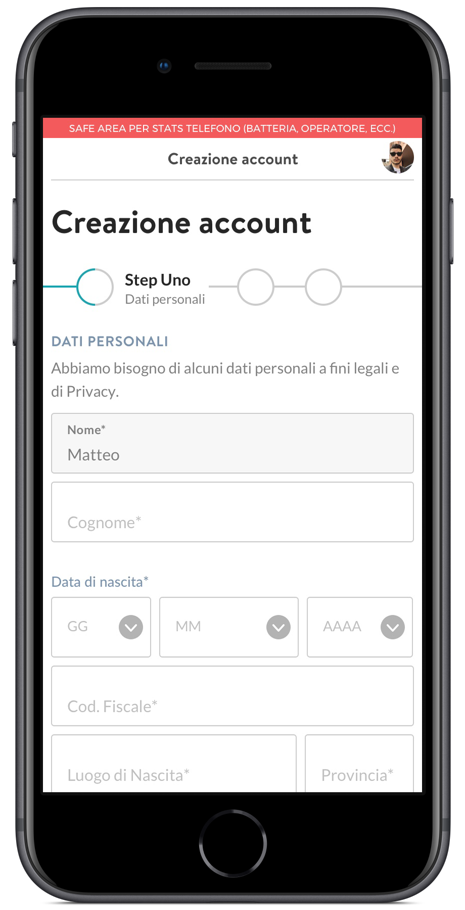
Onboarding process
& Account creation
Cuvify had two kinds of users: readers and writers.
Readers could create a FREE account (with some adv inside) or a payment account (without any adv during the experience). During the onboarding process, once selected that the user will be a reader, there ware some steps to determine the reader’s preferences in terms of genres and interest in order to suggest him the right books.
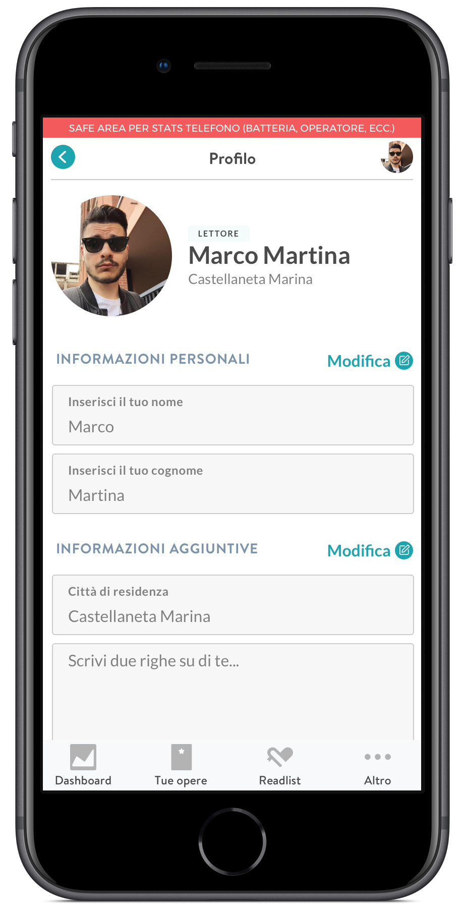
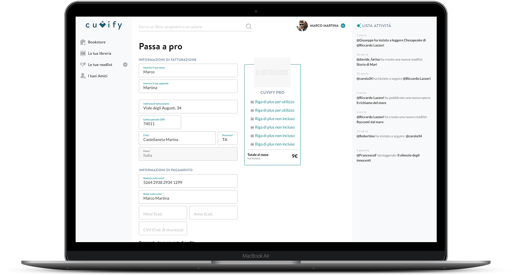
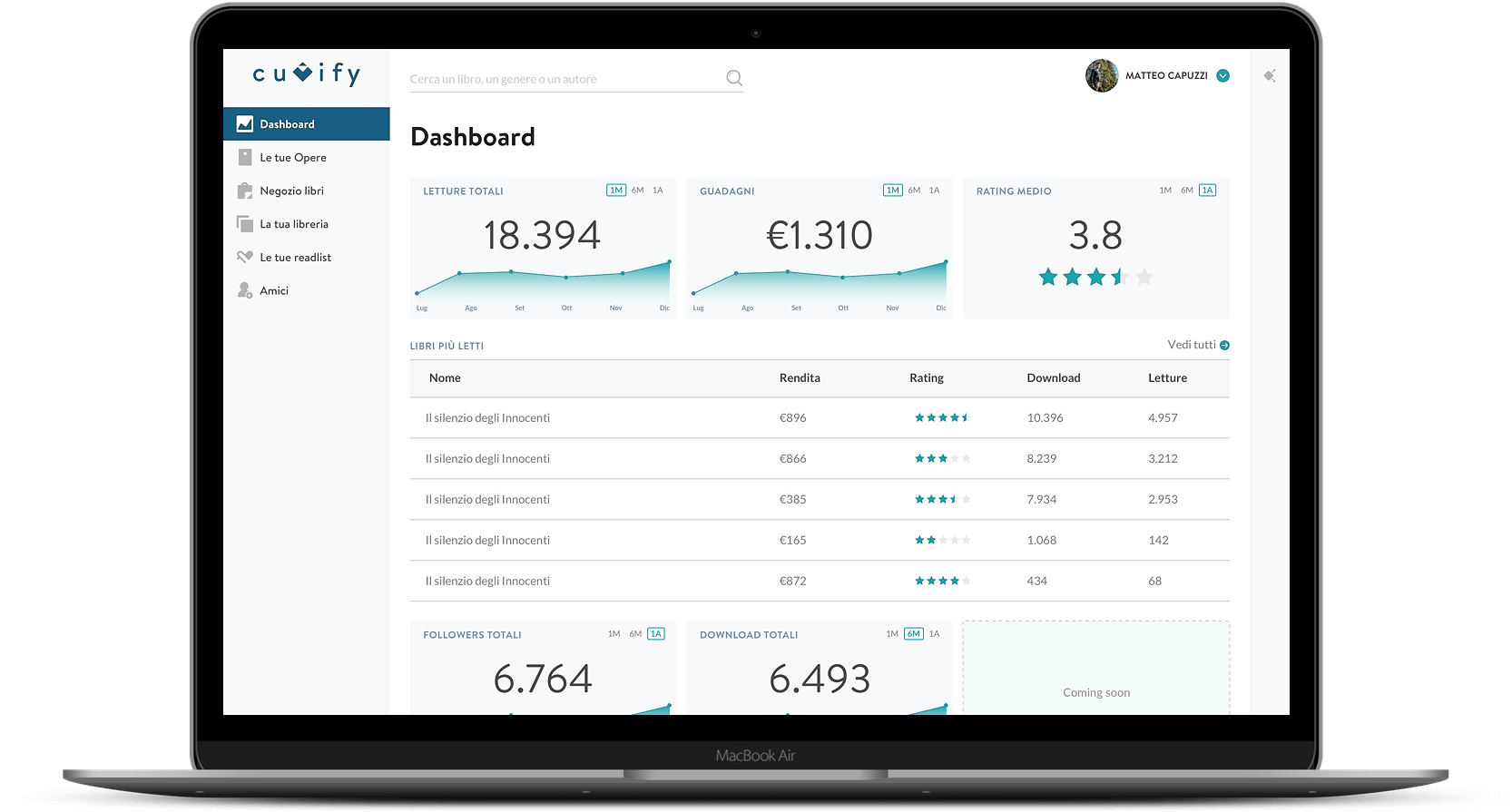
Writers instead, had a different account. During the onboarding process, they had to fill also billing data and connect an account (IBAN or PayPal) to receive the commissions made with their creation. They also have. later in the experience, a dashboard in which they could check every time useful insights about their books.
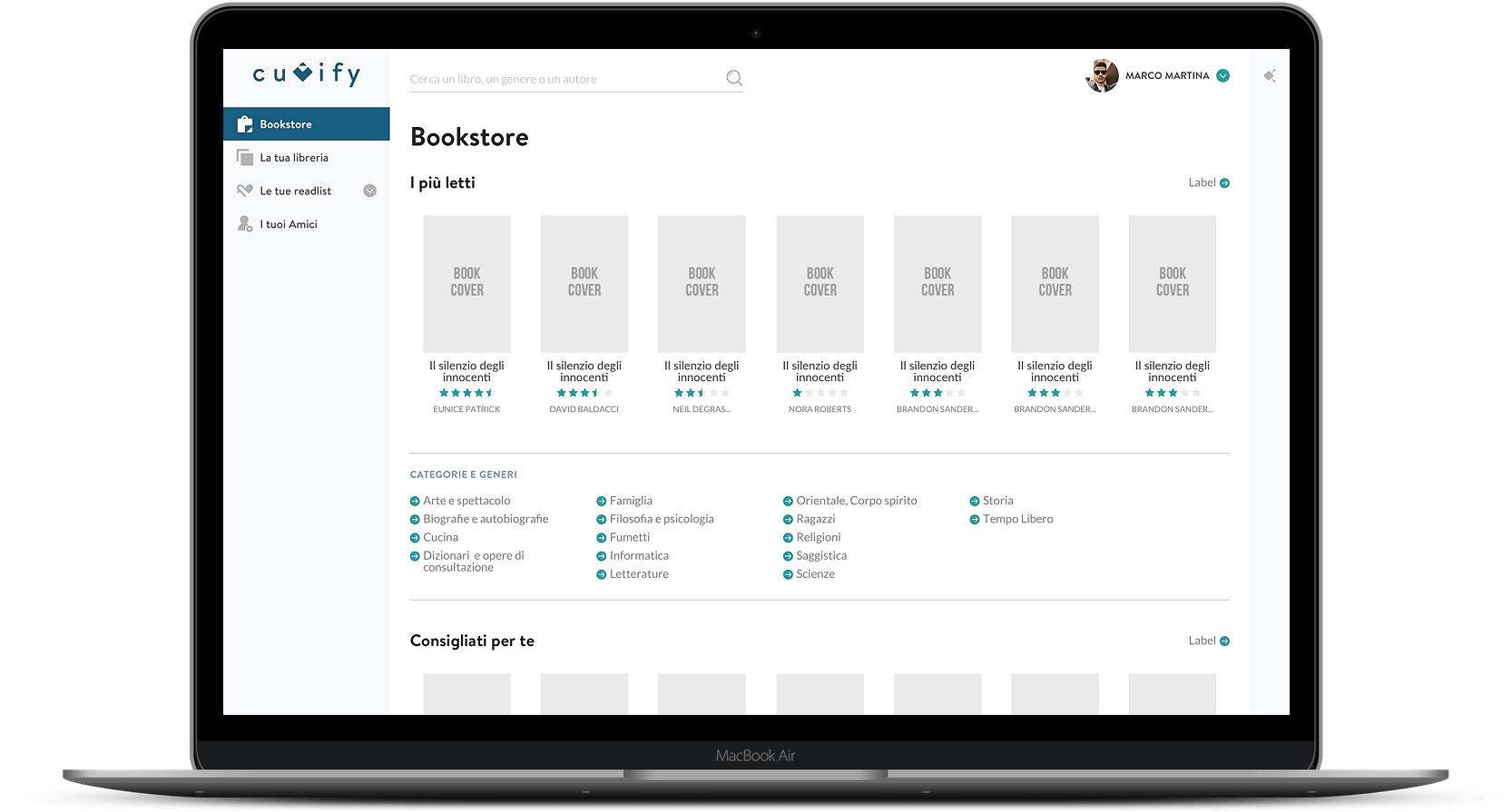
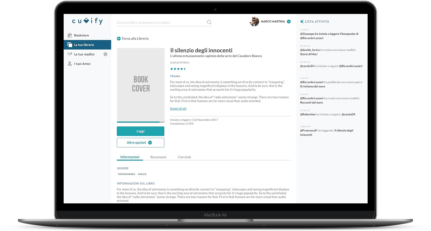
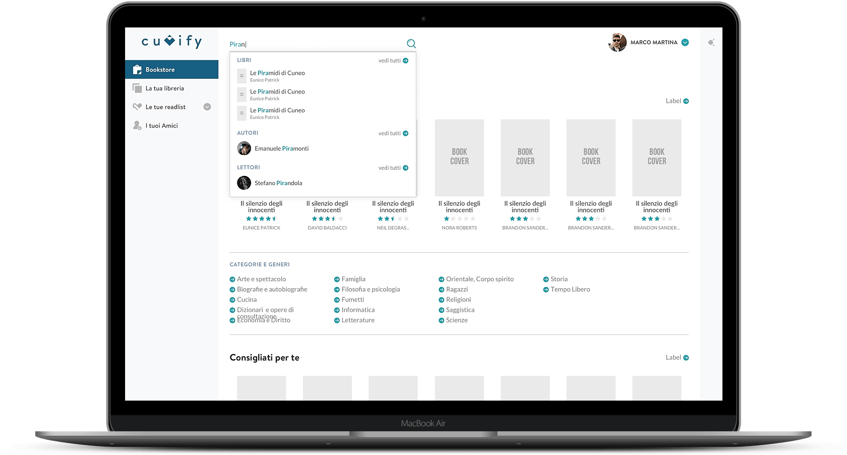
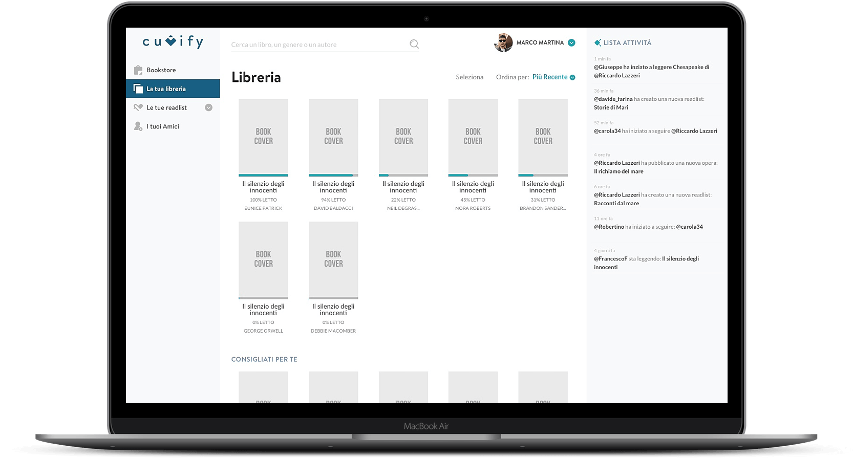
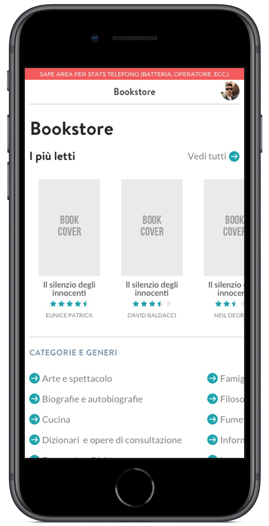
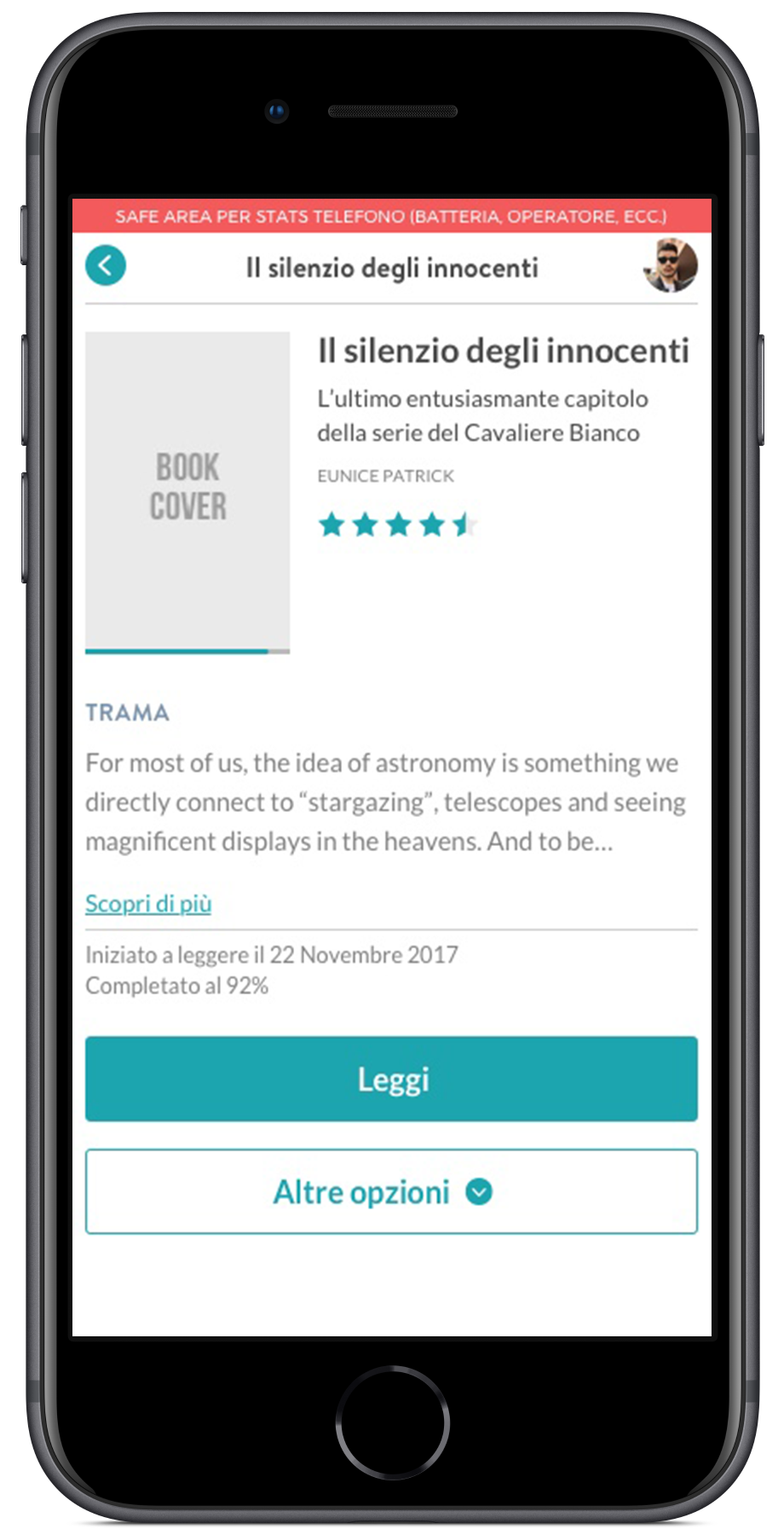
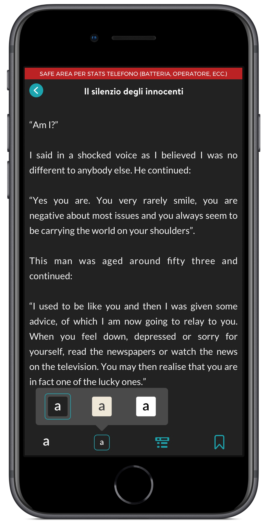
Cuvify’s goal was to create a huge library of the autochthonous writers.
The library page offers a broad view of books in the user viewport giving him the possibility to sort and filter between covers. Covers should be customized by the writer during the creation process, however, we also choose a color palette to cover the main book category replacing no-personalized cover with the standard ones.
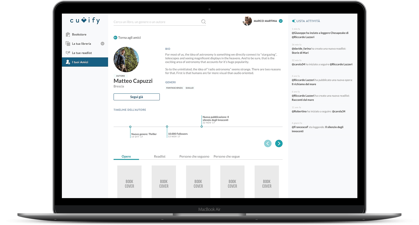
The book page offers the main information about the book, both technical and narrative, having also a big section dedicated to comments and reviews.
The read experience could be switched between two/one columns, light or dark background, adding a bookmaker, and changing font size and font-style.
Library page
& Reding experience
The Take-aways
Working on a completely new field was very challenging.
Create an E-book store is really complex. The hardest part was to create a simple way to filter and search the books because the data were a lot.
Also, the connections between readers and the writer’s profile require a lot of thinking and different design proposal before came up with a “good” solution.
“That’s the thing about books.
They let you travel without moving your feet.”
– Jhumpa Lahiri
