Client
Cosmote
Year
2016
Role
Team Lead, UX Designer Accenture AMA Team
What we did
- User flows
- Wireframes
- Final UI
Link
Re-design the Cosmote E-commerce platform.
Re-platform and re-design Cosmote.gr E-Commerce. It has been a long time taking project, especially designing the Main menu and the product page.
Limitations
E-commerce was made with Hybris while the self-care section was made with WCMS. The header and the footer of the site were the only common parts in the E-com, but that also meant that both the desktop and the mobile version would have had to have the same information. Some other technical limitations in using two different platforms for the same site.
How we approached
the project
The project was really huge. I and my team were involved as a UX/UI team after the requirements phase has been closed.
Our goal was to develop a new experience, especially for the E-commerce section, bringing our expertise in creating performing pages using best practices and knowledge from other projects.
They provide us a sort of style guide of main colors and brand guidelines, then we create all the digital design systems to use on the site.
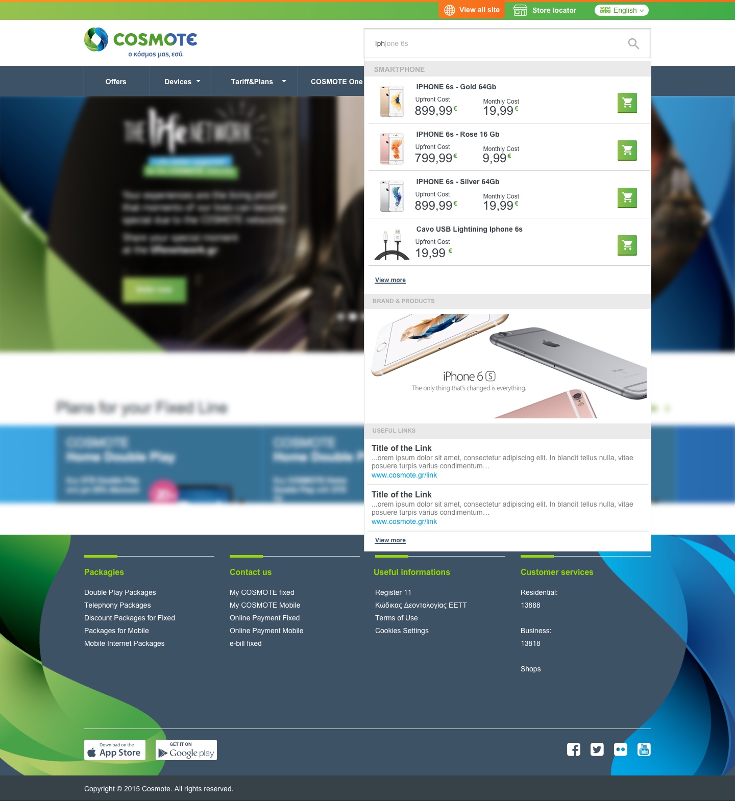
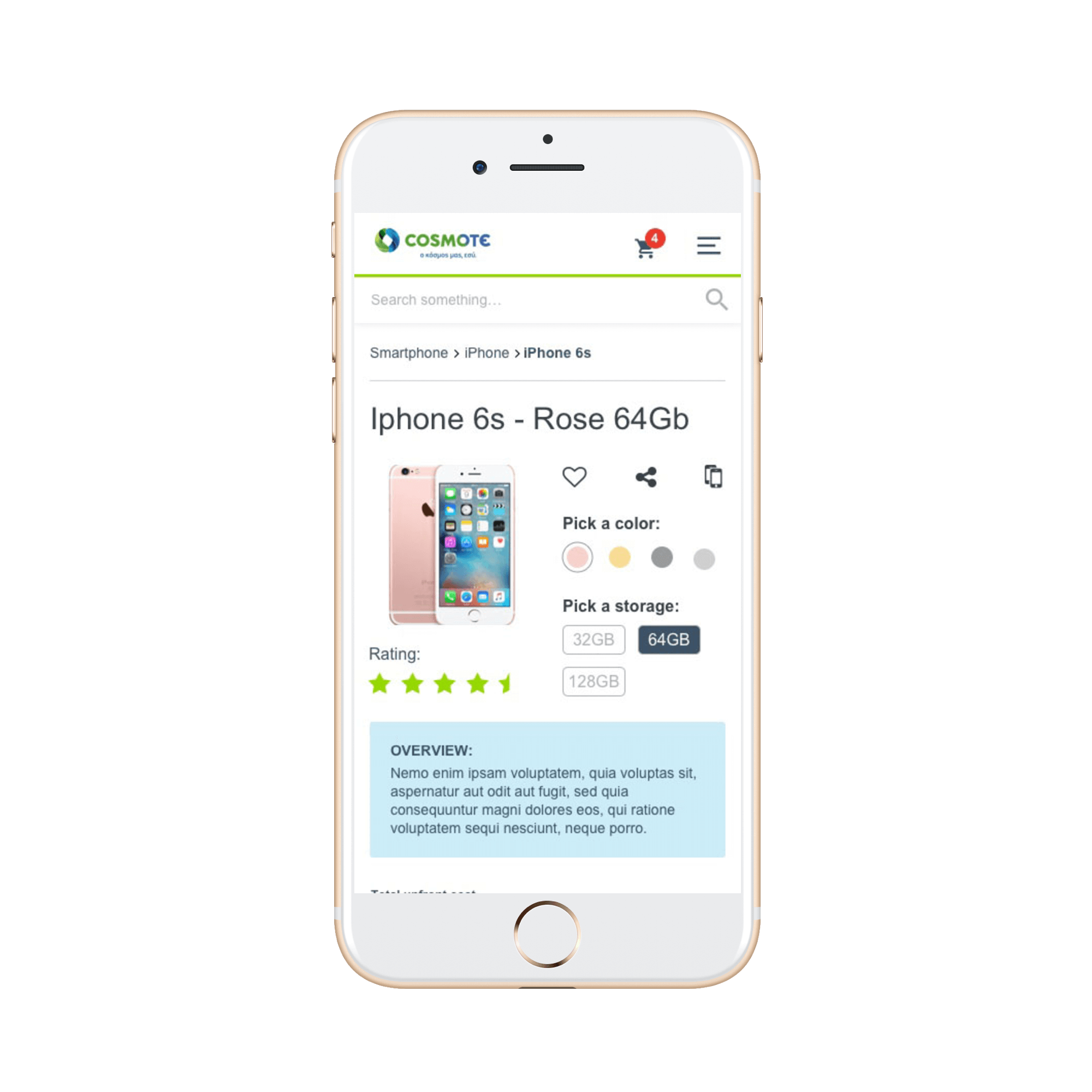
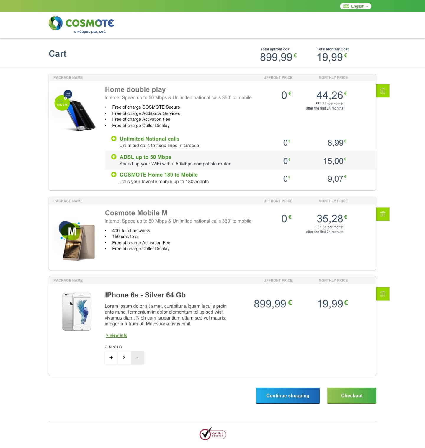
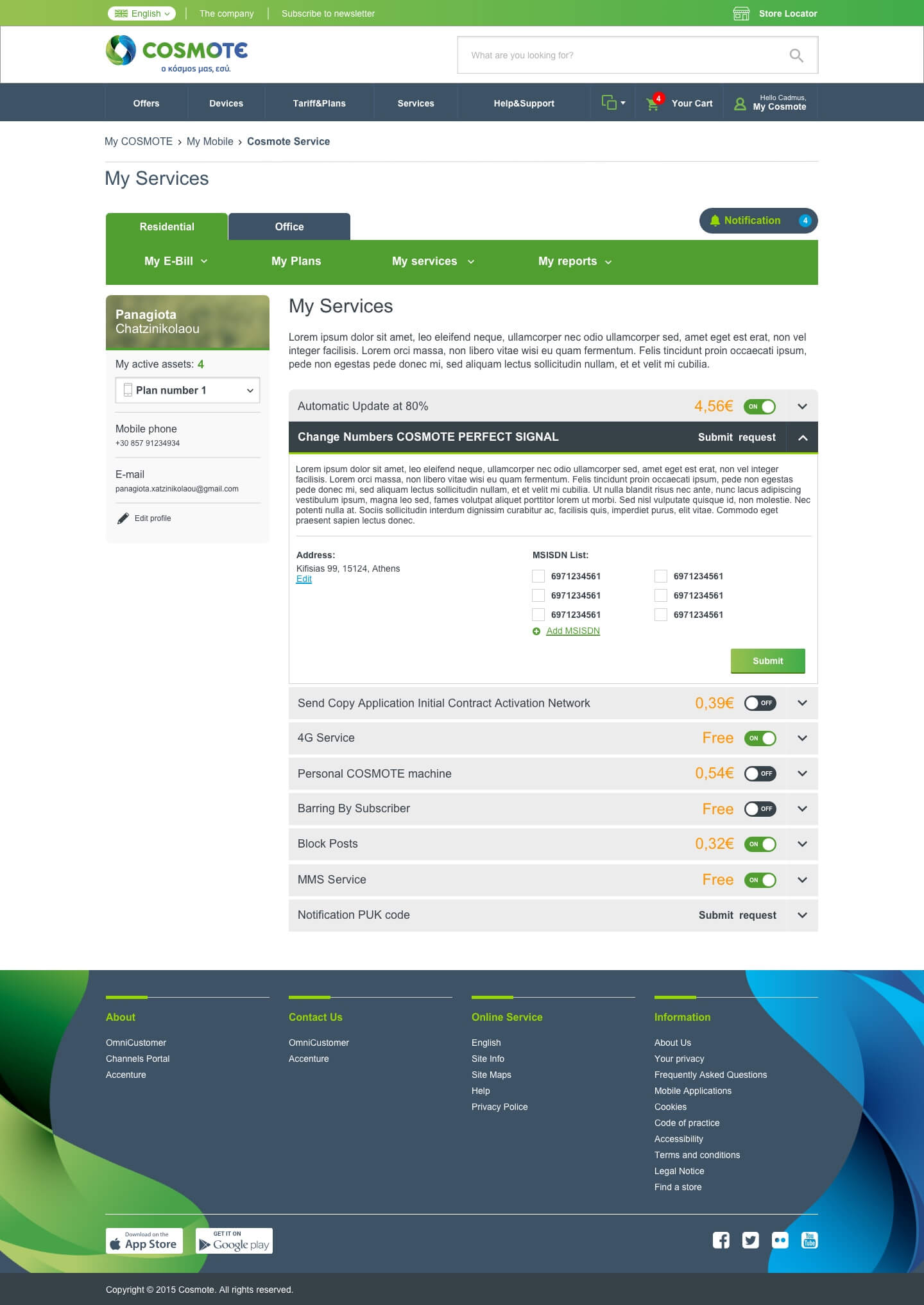
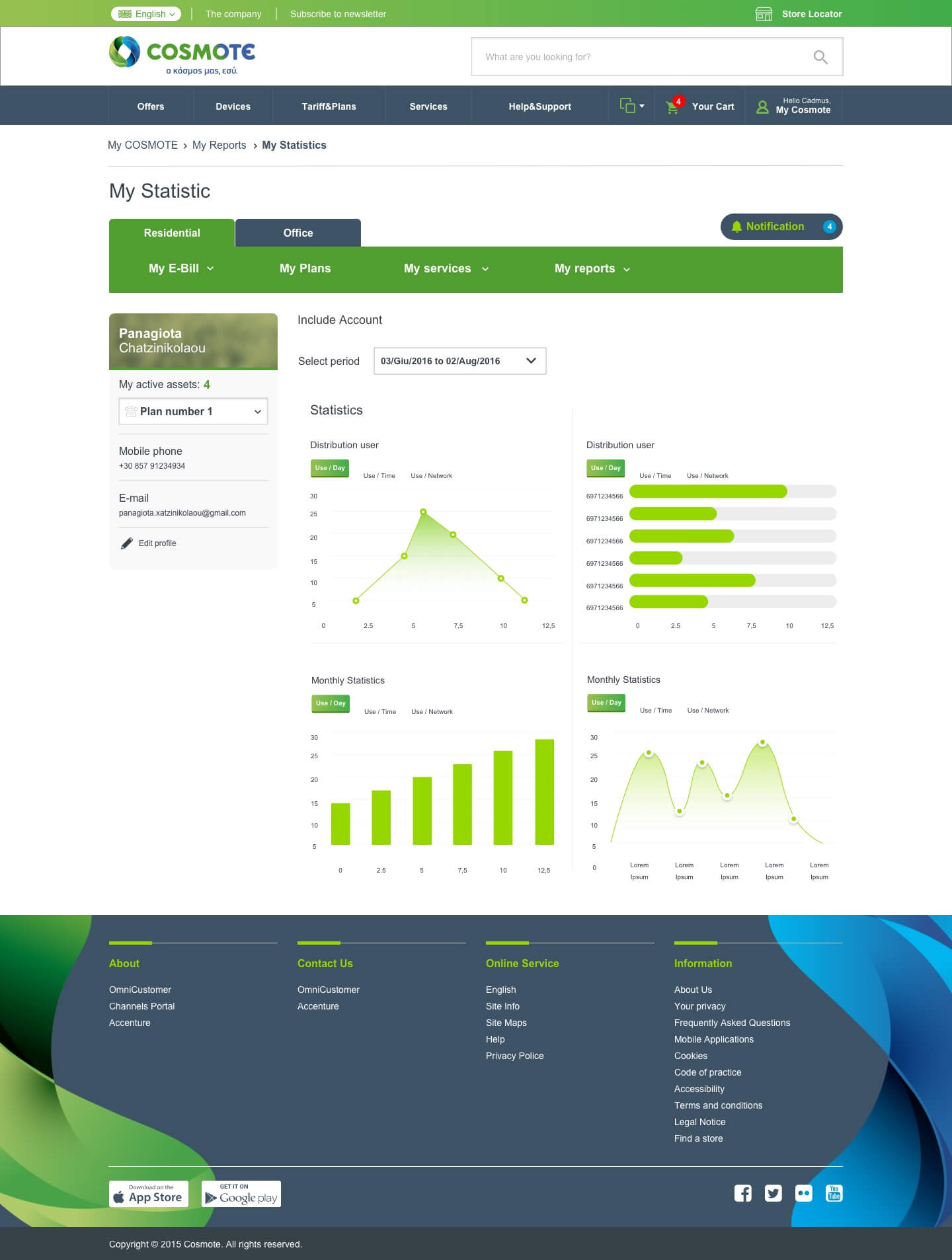
A huge work has been done on the information architecture of the Product details page, that in this case contains a lot of information.
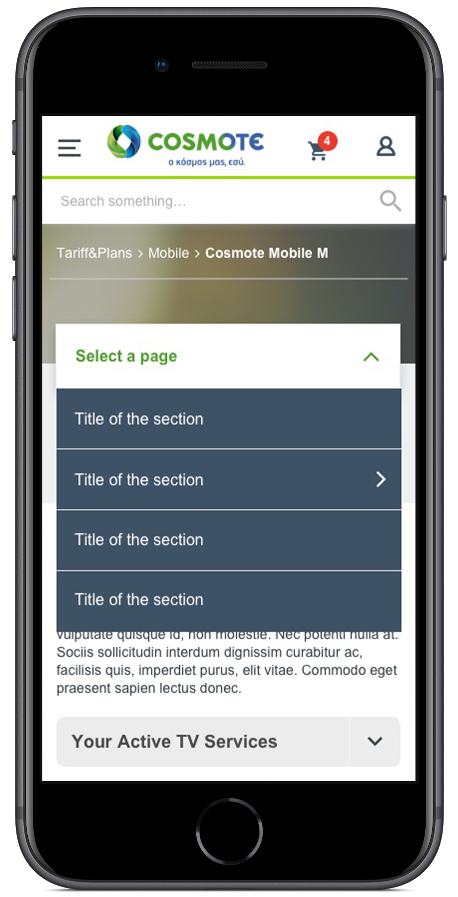
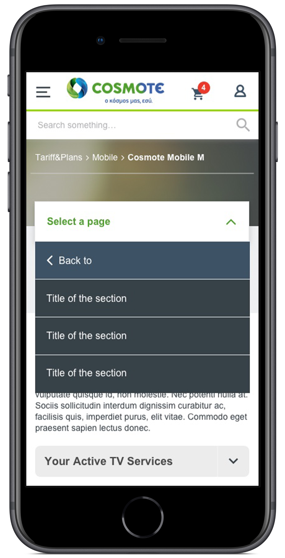
The first step was to re-built and re-organize the different parts of the site creating a sitemap of content and an organization tree of different levels; organizing them also based on the technical limitation in using two different platforms (Hybris & WCMS).
Then we started optimizing the main navigation of the site running some cart sorting and tree jacks test in order to validate the user’s path to reach the main part of the site.
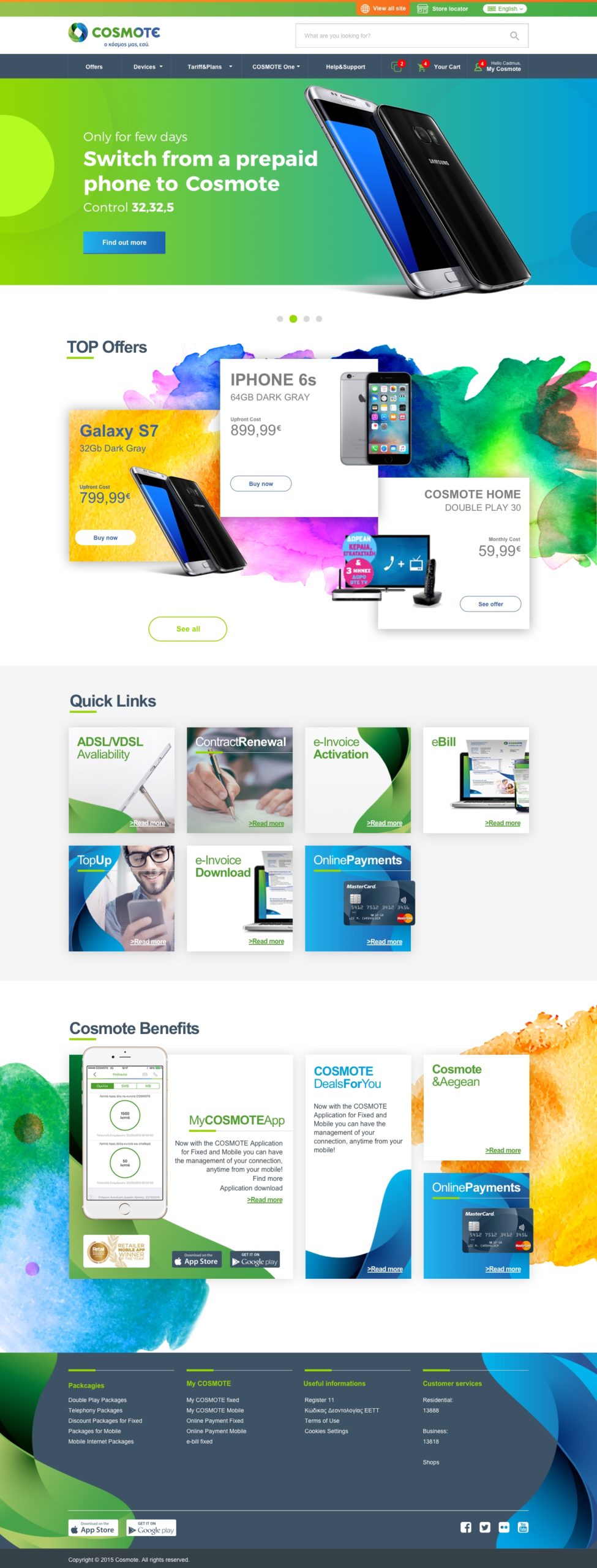
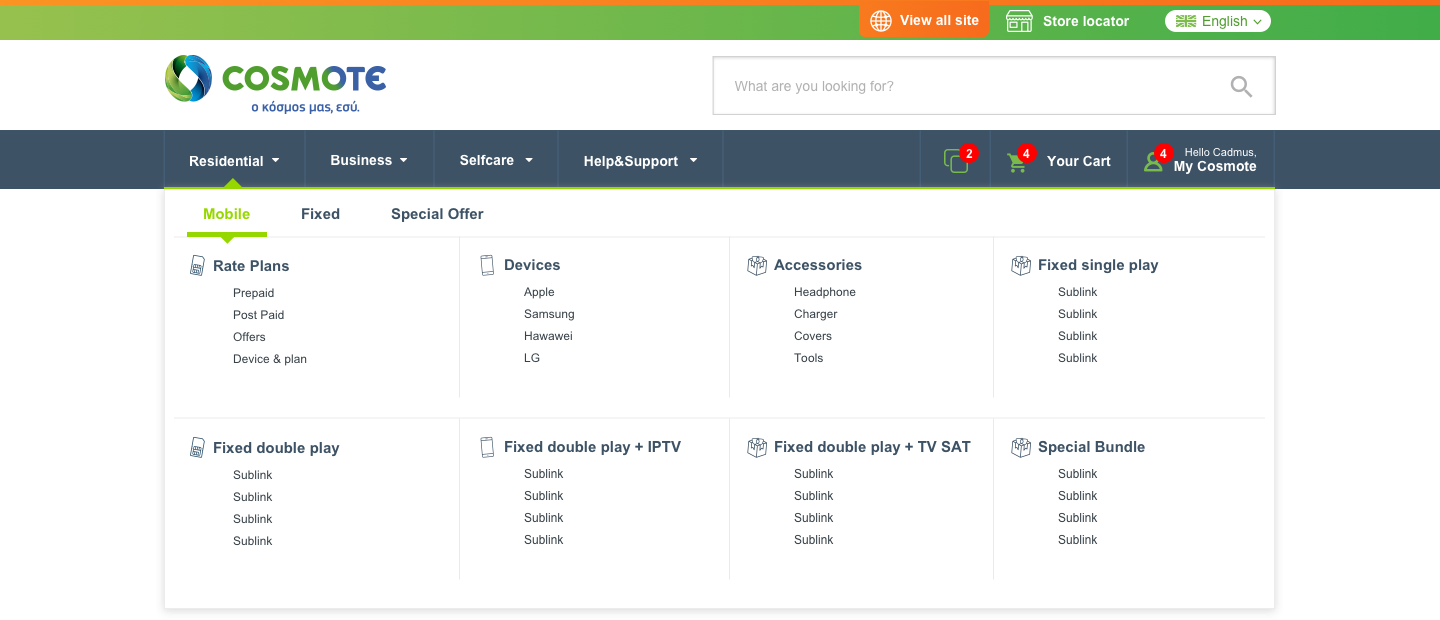
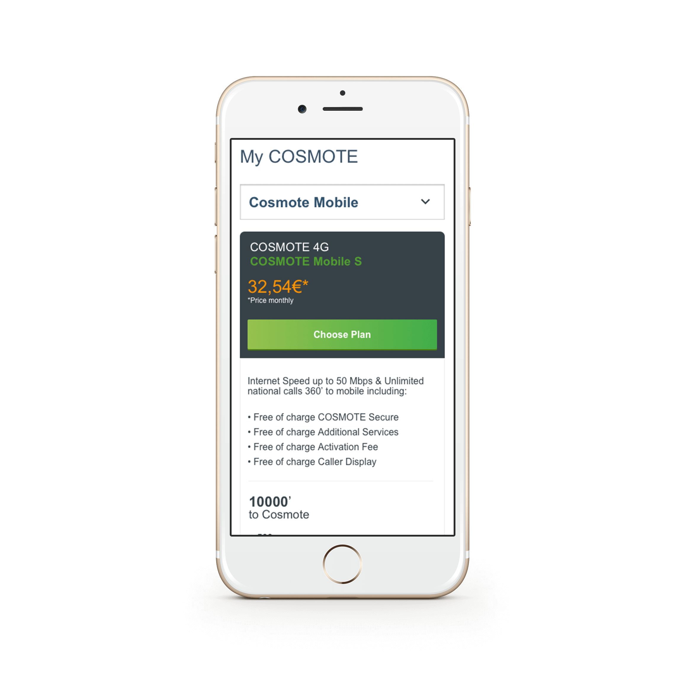
This approach results in three levels of navigation, originally splitter by “Residential” & “Business” with all the sub-categories associated. At the same level, we placed the “Customer service” section that linked to the WCMS platform for CS services.
Architecture & Navigation

Product details pages
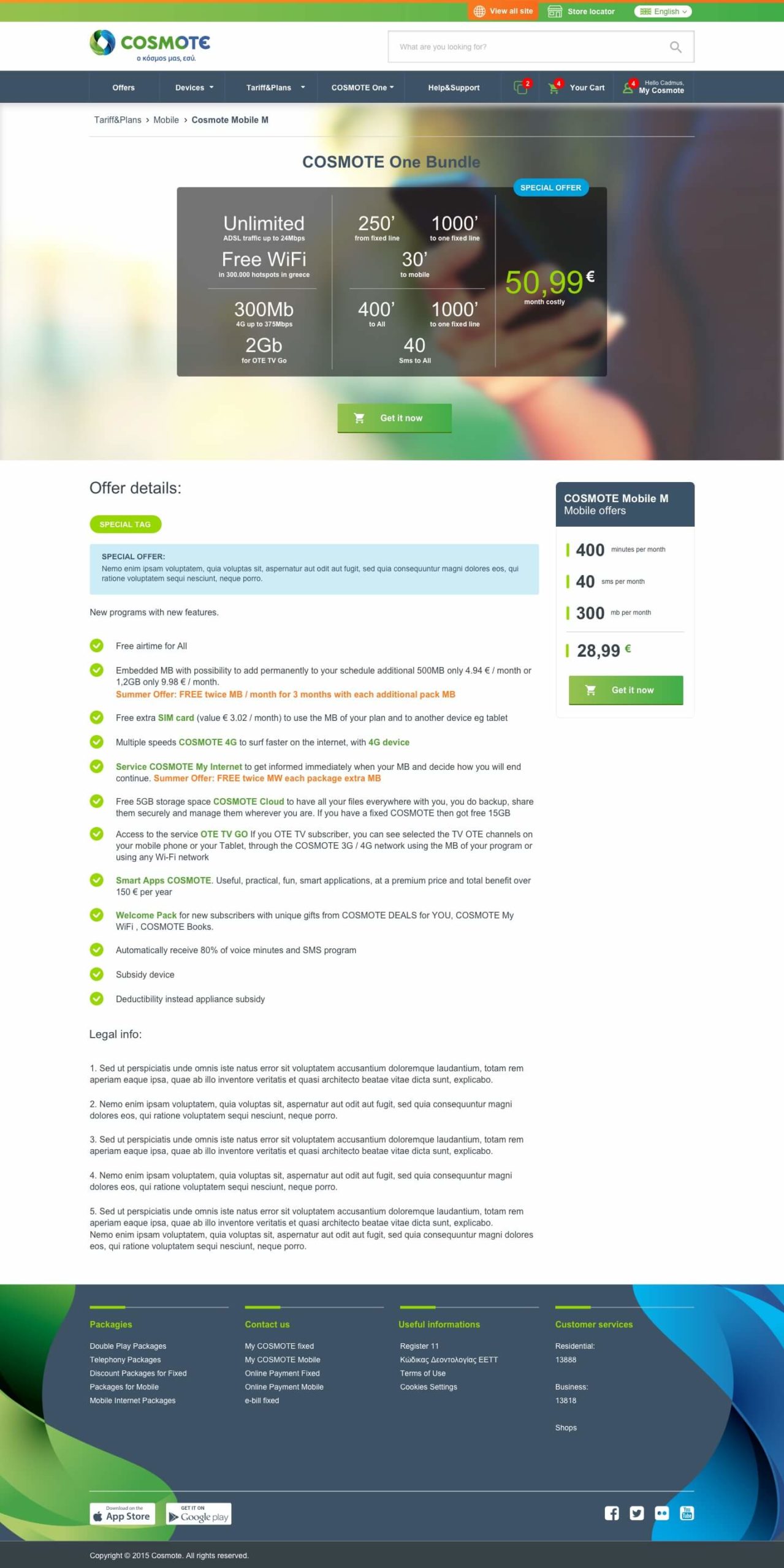
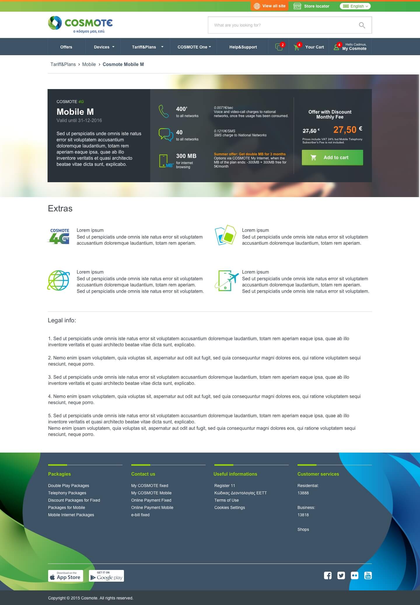
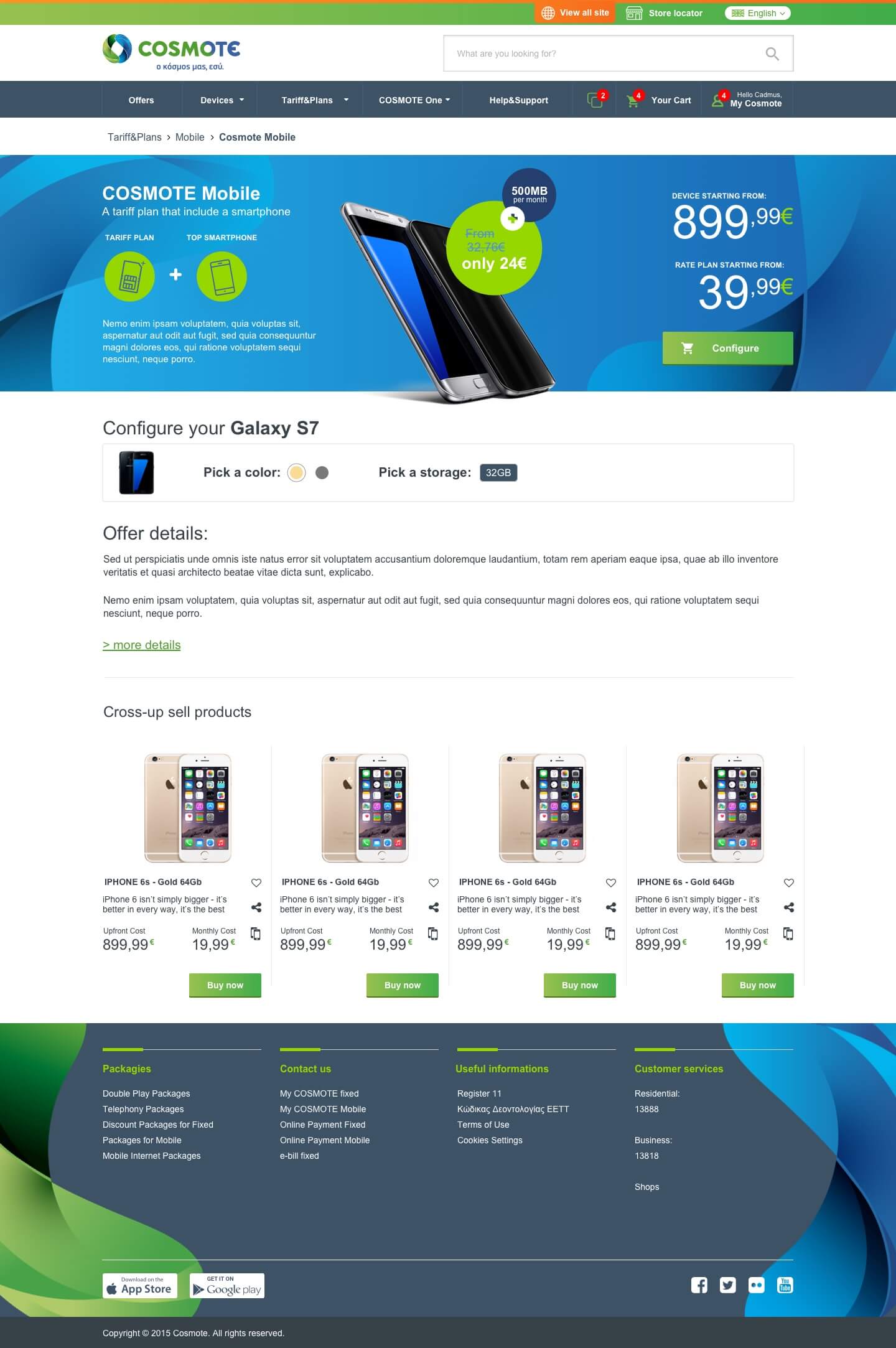
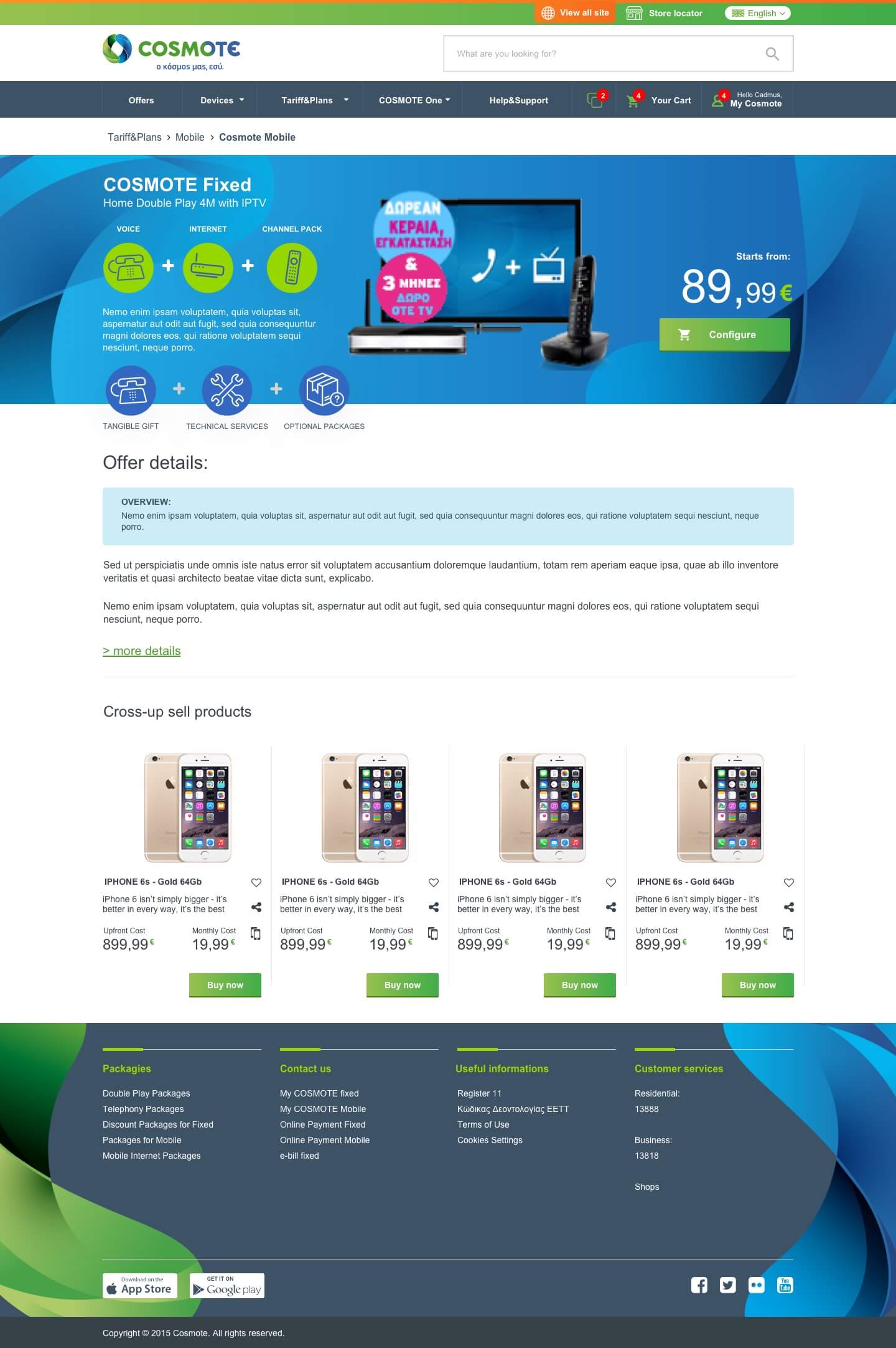
The hardest part of the project was to re-design the product pages, for different reasons:
- Huge difference in content length between Greek and English
- The high complexity of products and services offered (most of the time packs)
- High numbers of “included” features and triangulations between product
- Possibility to customize services directly on the page.
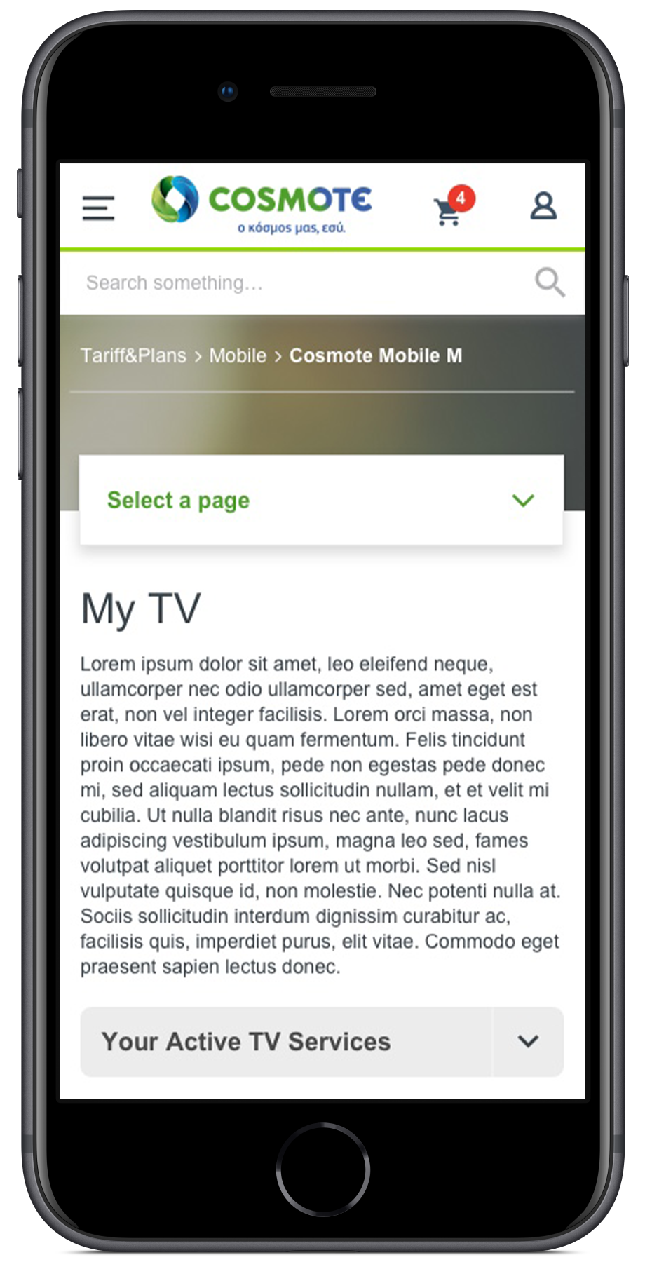
- Consider responsive layouts
These lots of complication brings UX to strictly collaborate with UI creating colors hierarchies (Green for “Residential”, Blu for “Business”) and product illustration based on WYSIWYG (What you see is what you get), that helped users in having also a visual guide between different offers and services.
Page was structured all in the same way, in modules, that based on content and type of offers, have been removed or added.
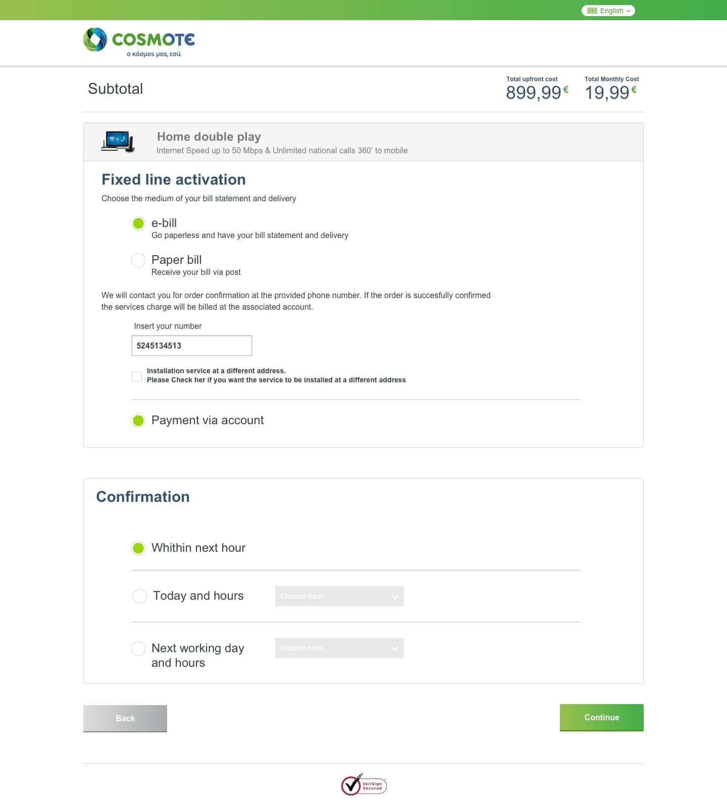
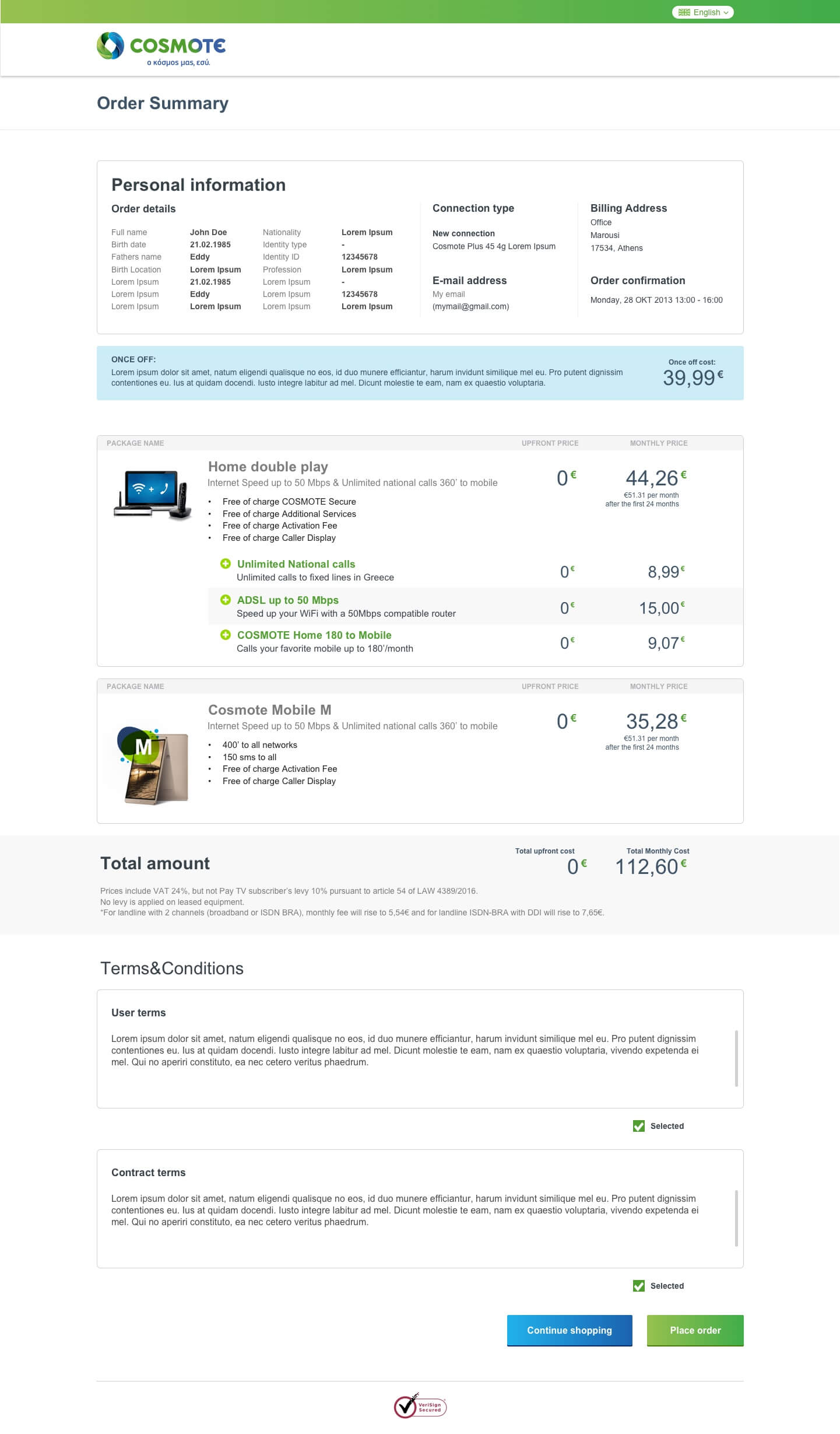
Also, checkout was one of the hardest parts of the project. The user could checkout with a physical product, with just a service or with a service + physicals devices that in some cases need an installation. So the checkout flow sometimes integrated also a “schedule an appointment” with the engineer.
Checkout
The take-aways
Firstly, how to approach a huge project, with a high level of complexity and many stakeholders, also how having restrictions and limitations brings you to reduce the amount of information and come up with simple and practical solutions.
Awards
Cosmote.gr won the Grand Awards of Mobile Excellence Awards ’17 organized by Boussias Communications.
Other categories won: Customer Care / Experience, Innovative Mobile R&D project, Mobile Service for Consumers, Mobile Service Provider with International Expansion, Mobile Innovation for The Internet of Things, Mobile Broadband Initiative / Services, Infrastructure Strategy Initiative / Investment.
“All is big, until it is solved to become small.”
― Svetioničar