Client
Year
2019
Changing the dress.
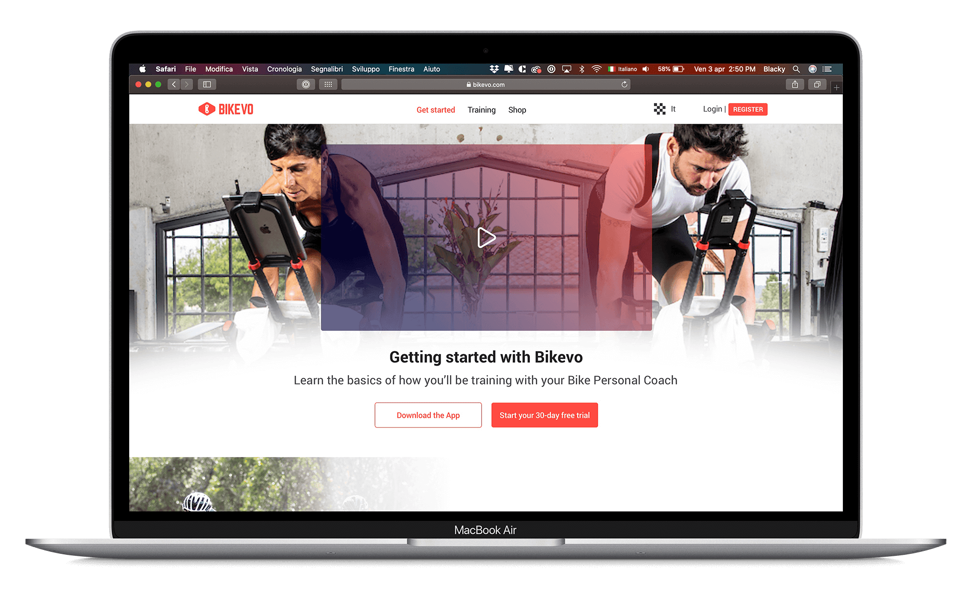
Refresh the site of the “Bikevo” applying the same UI used in the app. Adding some information on the new functions developed and showing the screen of the new mobile application.
Limitations
Time and scope of the project, the main goal was to re-design the site with the same UI applied to the Mobile App but without changing too much the structure of the old site.
How we approached
the project
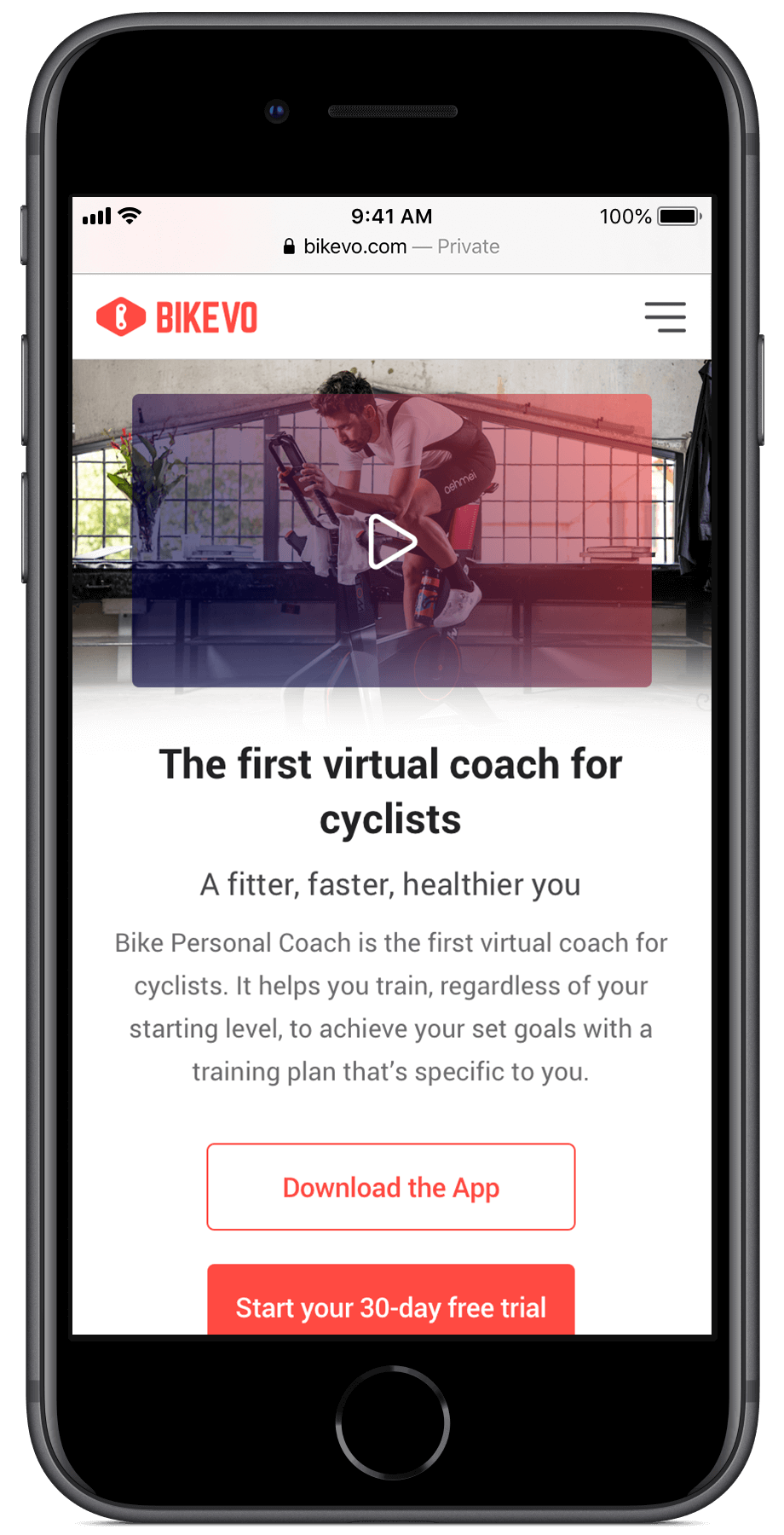
The aim of the project was to refresh the old Bikevo site based on the new UI we developed for the mobile app.
There were also few new features to add related to upload and manage workout sessions on 3rd part apps or when the wi-fi or any network was absent, but they are mainly in the “user-profile” pages, not in the “marketing front-end”.
The main goal of the site was to present the main features of the mobile app and the coaching system to push users to download the app and try the coach by themself.
The site had to be simple and, given the fact that the old site was built on a pre-structured backend, the space to creativity and innovative solution was limited.
First of all, we changed the tree of contents, giving more space to the main product “Bike Personal Coach” e reducing a lot of pages and content related to other minor products (some of them already integrated with the coach). Then we refresh the palette of the site, jumping from a “dark” palette (black background, deep blue shadows, and gradient, indoor-only, and athletes only photos) to light and sporty palette (red as the main color, white spaces, white background, photo in action and bright). Images now show both man and woman because “Bike Personal Coach” want to be a product for all the cyclists, of all levels and all ages.
Most of the CTAs on the site pushes the user to download the app and starting his 30 days Free trial of the product. Together with the closing section just above the footer that helps the user in the final action after he scrolled and read all the contents.
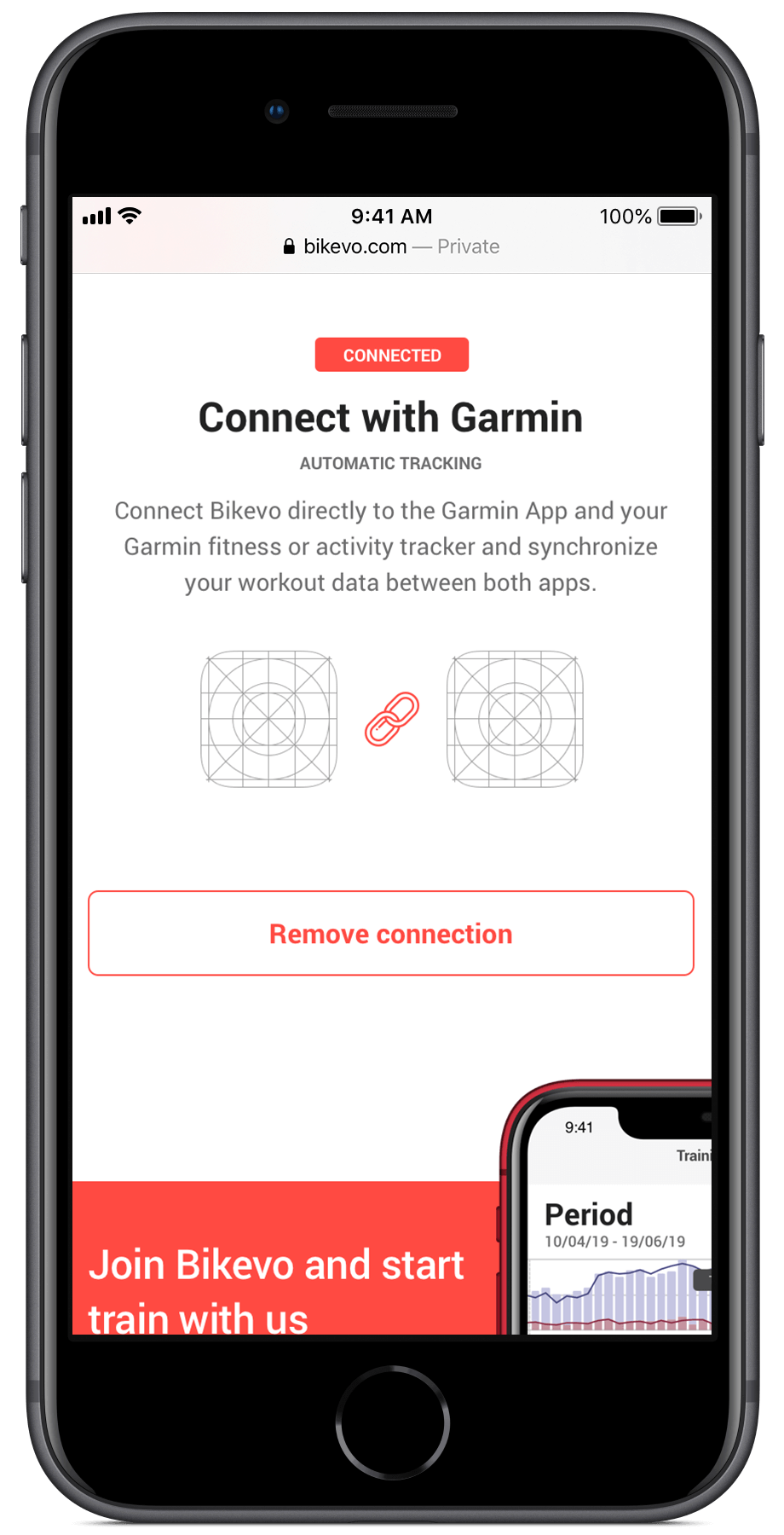

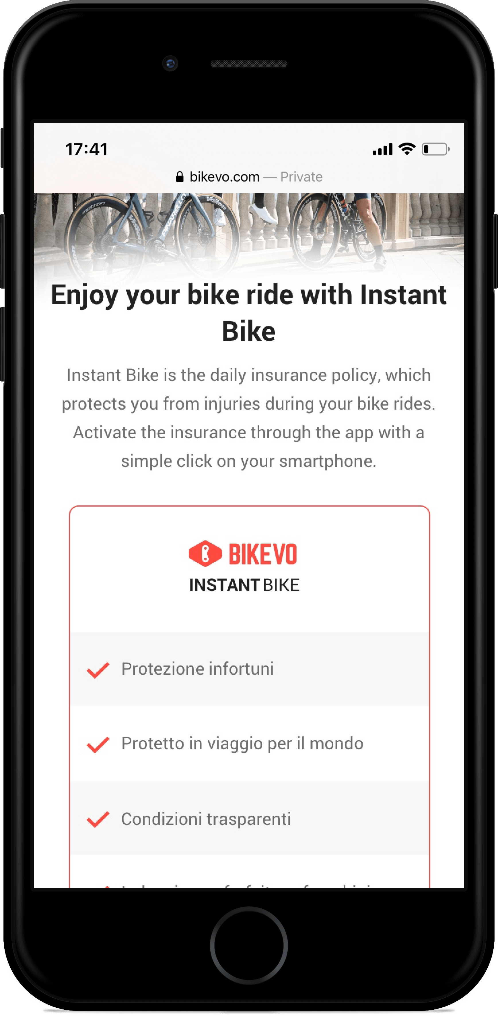
Main traffic coming to the site from mobile devices, so the layout had to be simple and with the minimum amount of information that pushes the user in downloading the app or creating a FREE account on Bikevo.
Get started
In the “Get started” page, we just present the 4 steps you need to start using “Bike Personal Coach”, super simple, super fast.
Train page
In the “Train” page, we split down the most valuable features of the app, making them simple with short copy and app-screens to help the user better understand all the features. At the end of the page, we place a table with all the features included in Bike Personal Coach to helps users missing information about the product and try to cut all the doubts.
Mobile experience
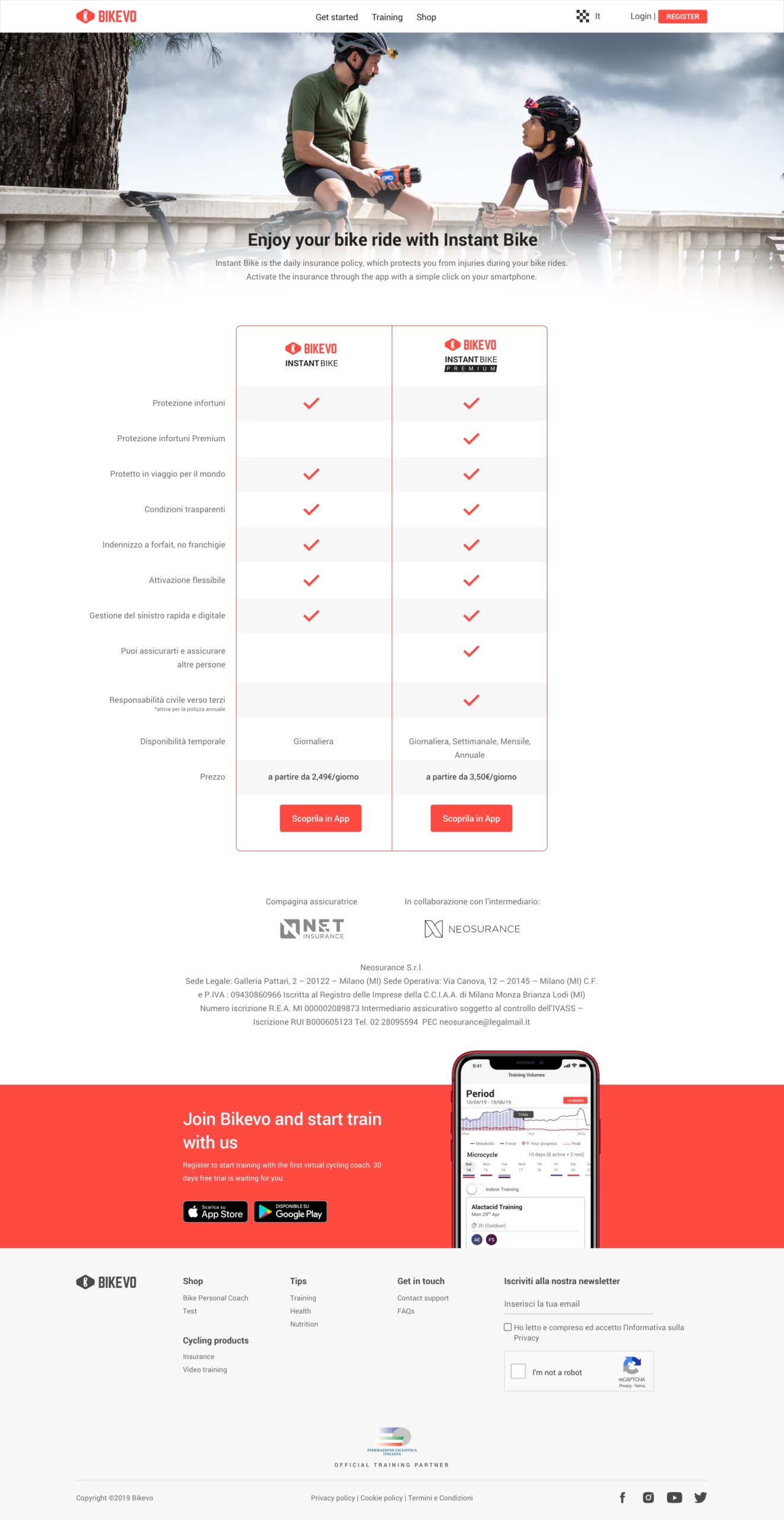

Desktop experience
The desktop was simpler than mobile, you have more space to explain features, showing app screens, images are huge and big helping user to really enter in the “Bikevo” world.
Shop page
In the “Shop” page, we present the “Bike Personal Coach” and the related price.
Blog section
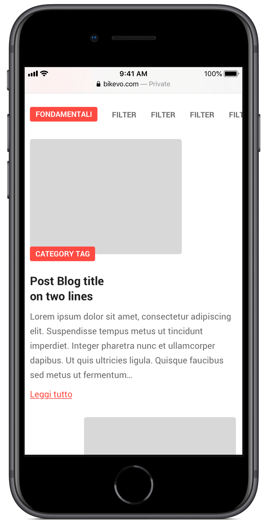
Blog section was refreshed with new UI based on the data of the old layout.
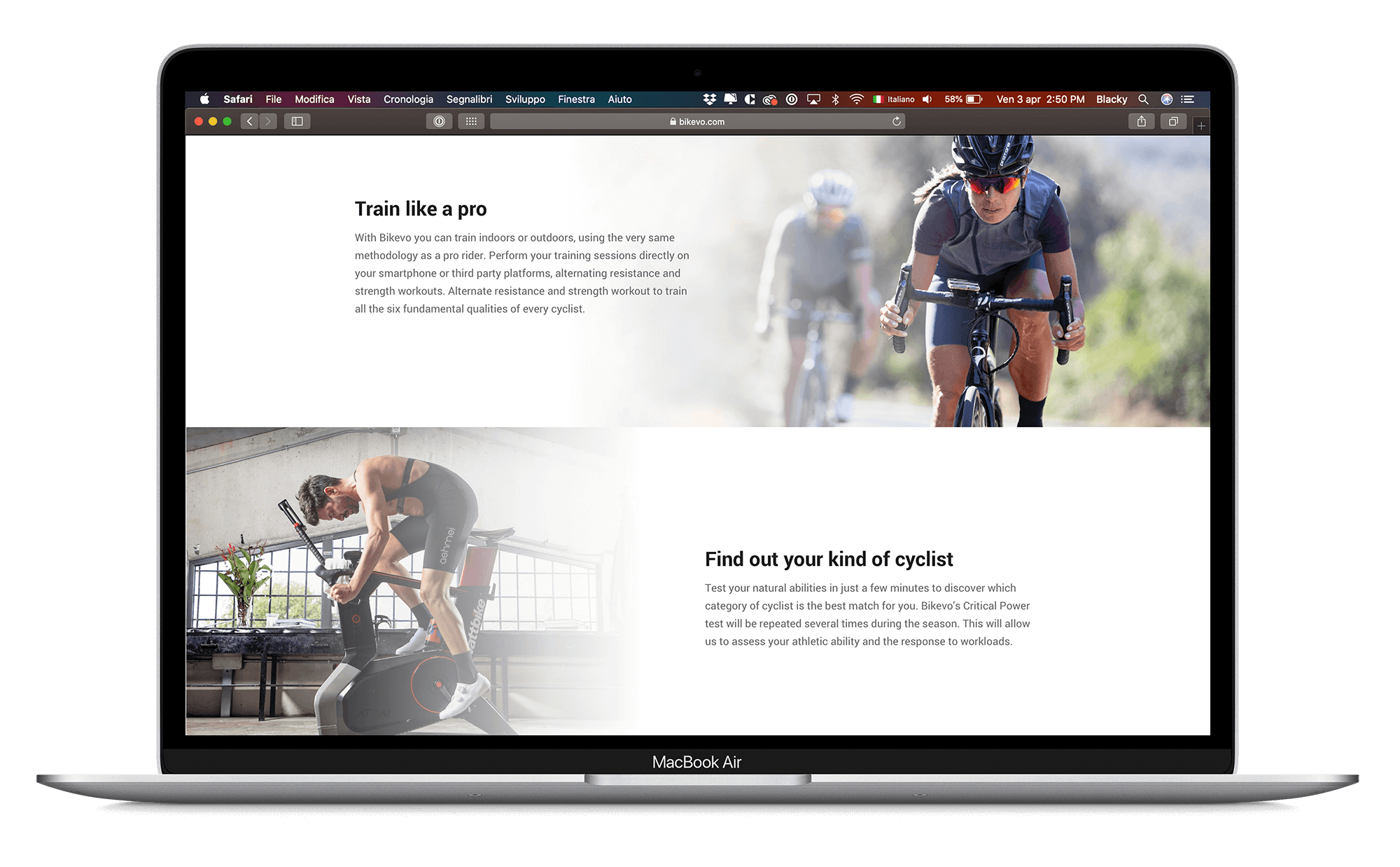
The aim of the website is to send traffic to the store to download the app, this forced me to avoid create many contents or try to present too many details about the app.
The site forced me to stay simple giving the minimum amount of information in order to convince the user to download the app and start the onboarding process.
