Client
Year
2016
Role
- UX Designer Freelance
What we did
- UX Strategy
- User flows
- Wireframes
Simplify the way you think about your future.
Helvetia Insurance wants to launch a digital survey to engage users and show them how much time they could save signing up with them.
This survey will have to be clear and understandable by every user.
Limitations
Time was the main threat to this project. Moreover, the charts provided by the Company were not very straight forward.
How we approached
the project
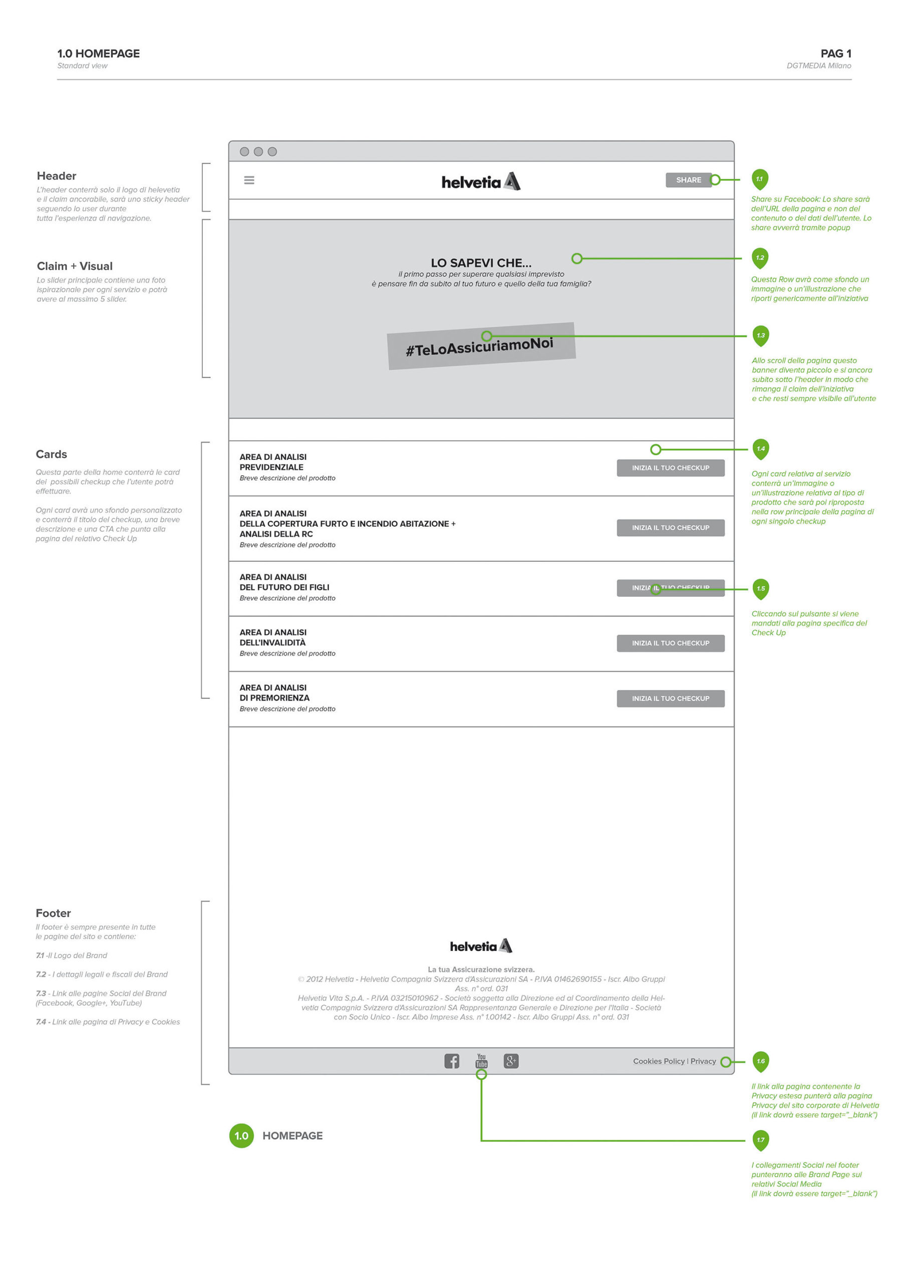
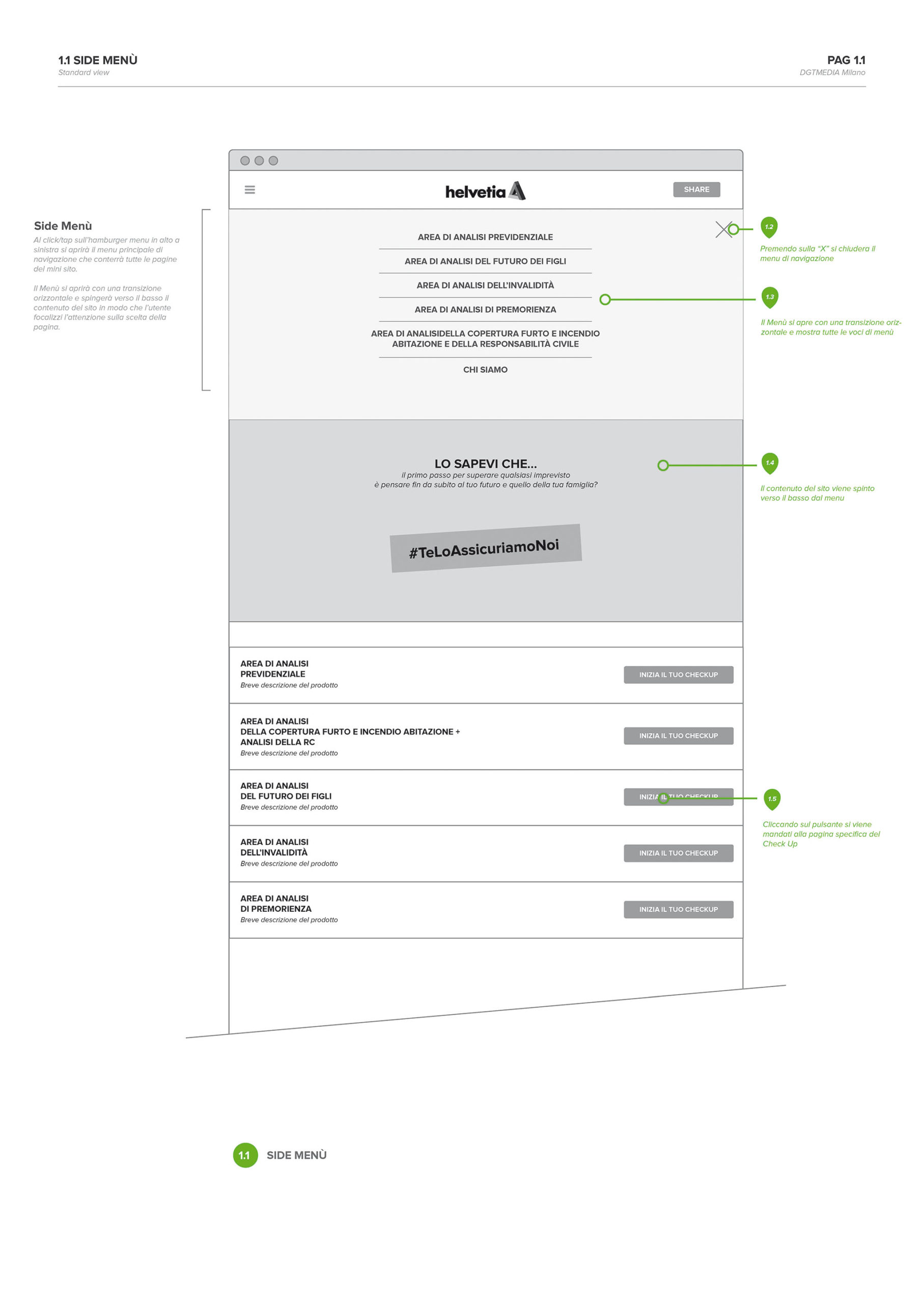
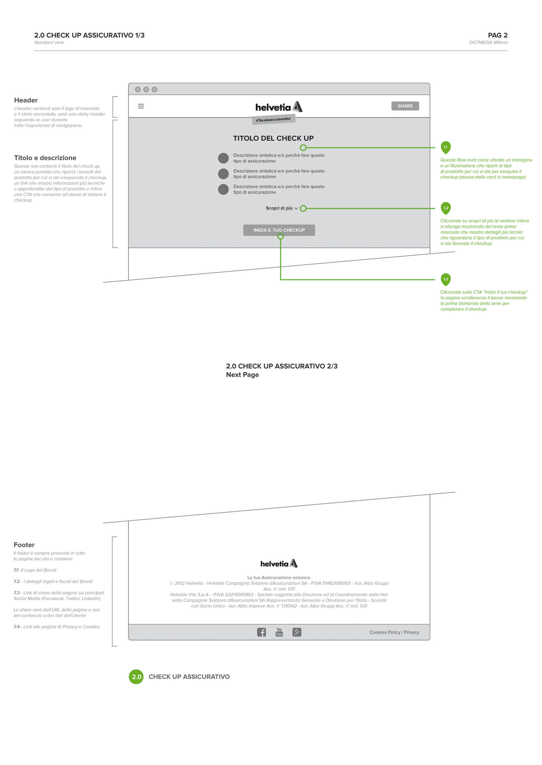
As UX Designer Freelance I worked on the sitemap, the user journey, and detailed wireframes, writing down technical notes for the Development Team and the UI designers.
Helvetia’s goal was that users submit the whole survey and avoid any of them to abandon it before the end.
Started designing the user flow I came up with the idea of designing a Landing page for each survey so that the user could easily select the topic they were interested in.
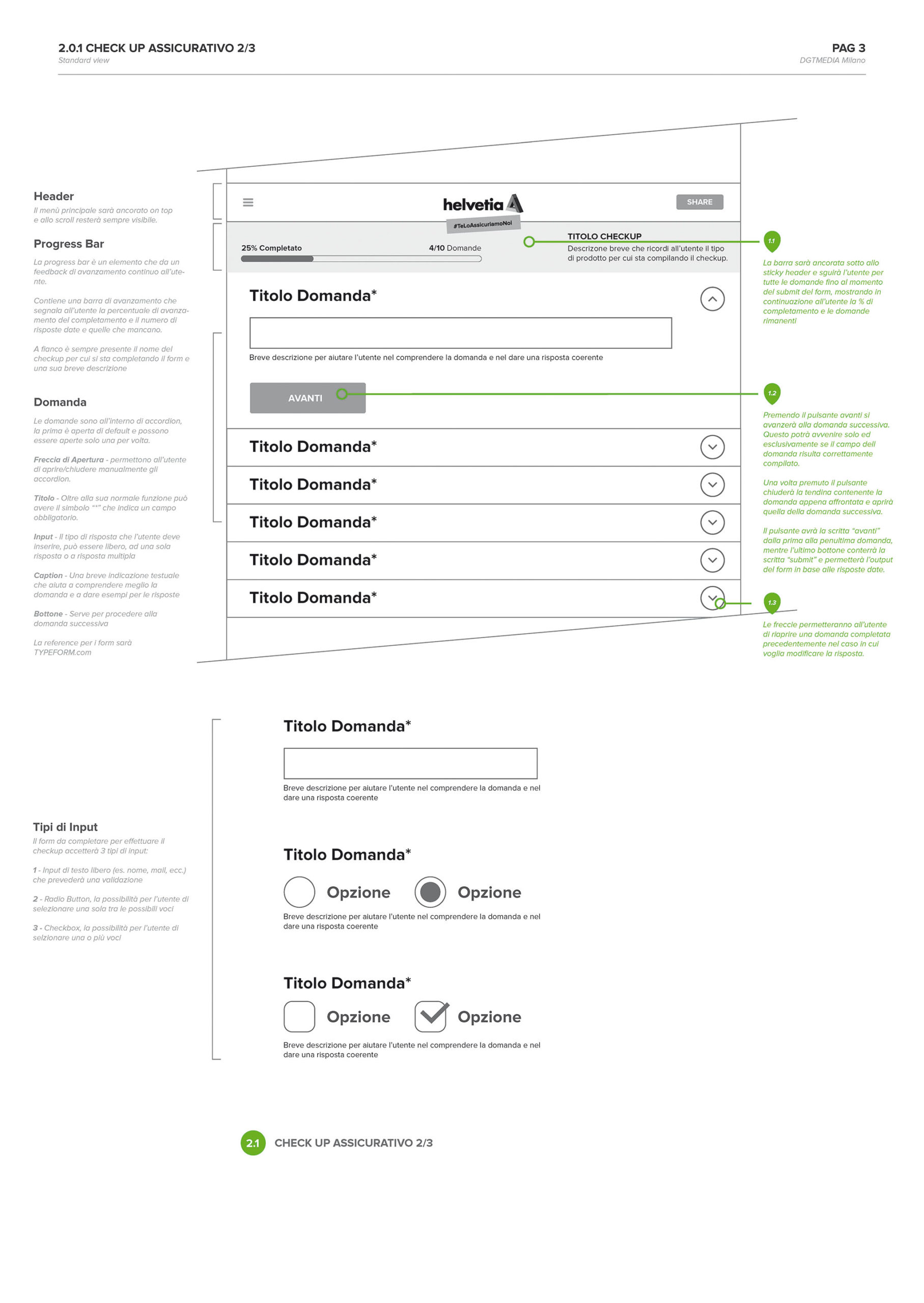
Then I focused on the questions interface. Users were able to check at any point, which stage of the survey they were at, and had the possibility to go back and check their previous responses, but not moving to the following one, with no answer at all.
The interface was simple and linear, avoiding any type of distraction and letting users focusing just on one task: answer the questions.
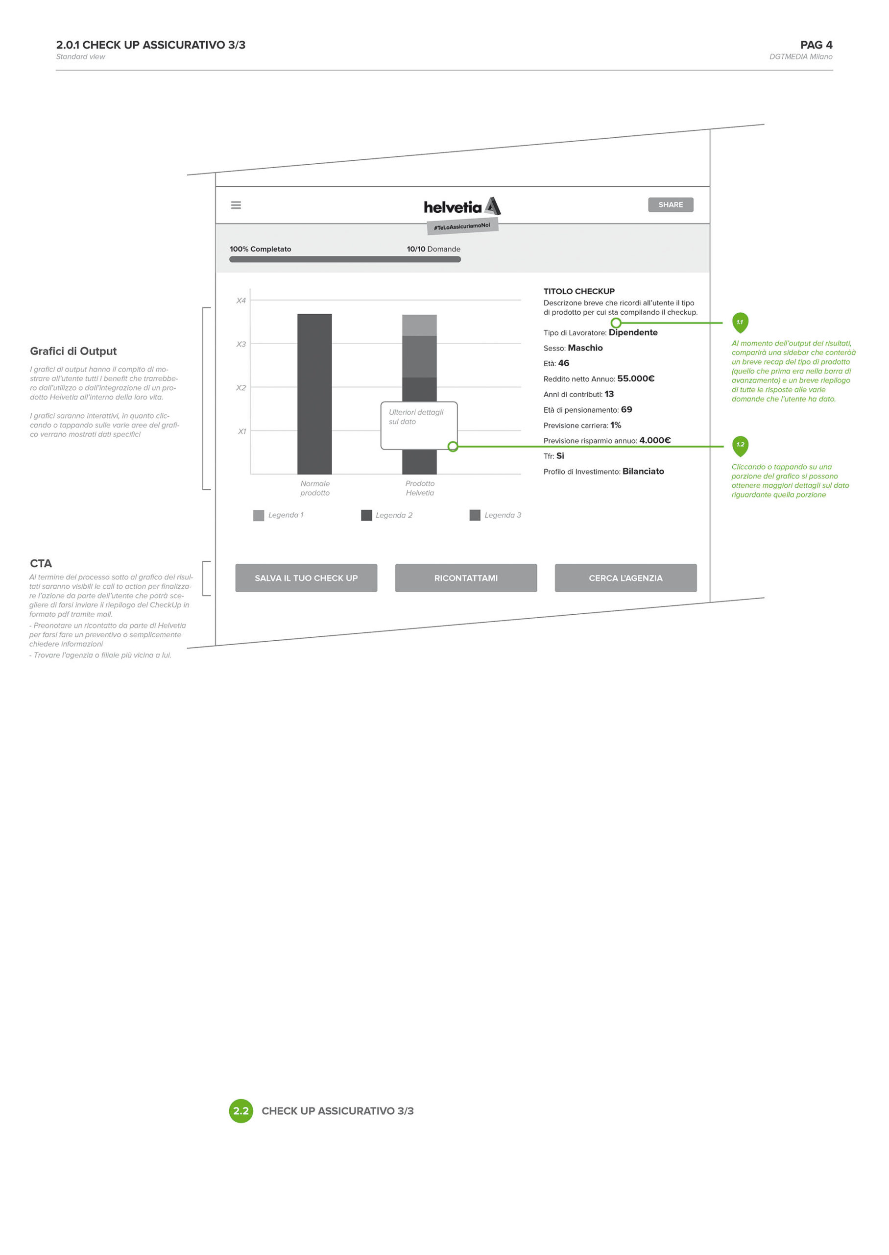
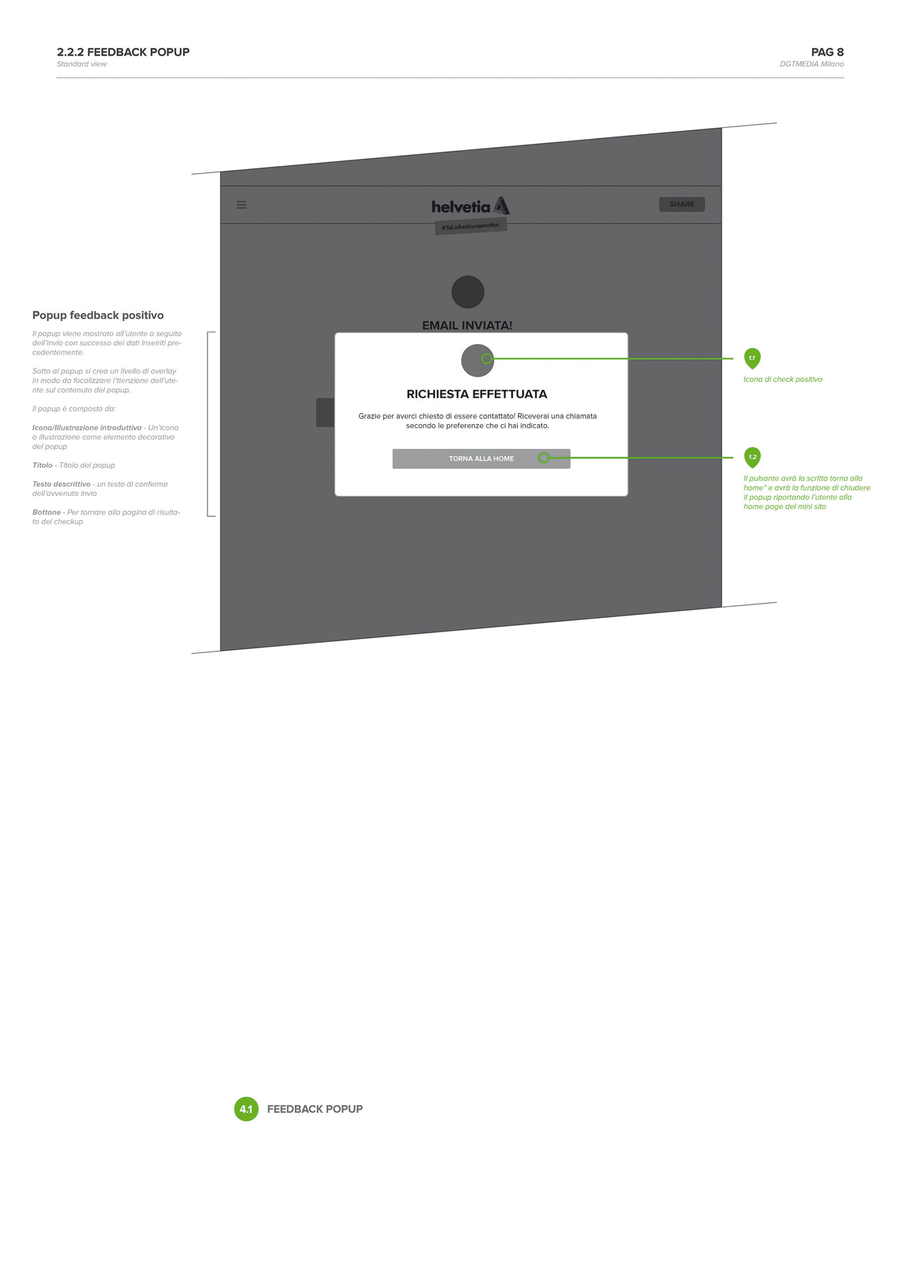
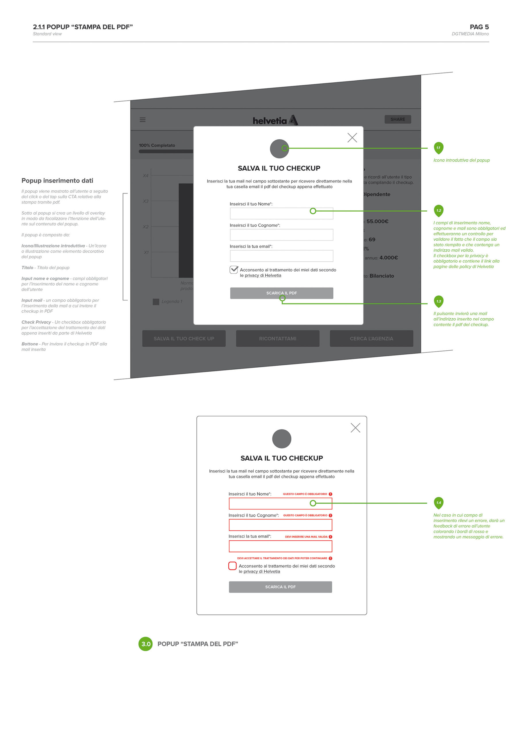
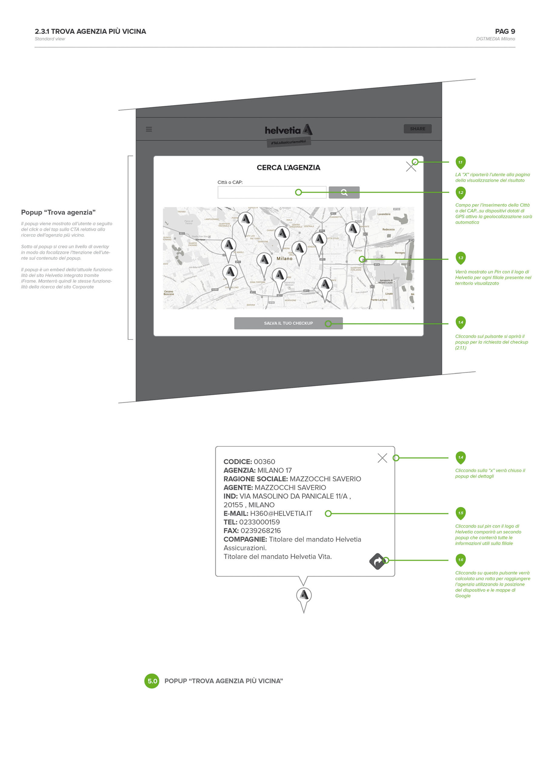
The last part of the survey contains some visual charts to summarize the user answers and giving them an easy-key to read and understand the proposal of Helvetia based on their answers.
I have learned the importance of avoiding any unnecessary information in each step. Users were able to focus on one selected topic at the time, with no risks of confusion or misunderstandings throughout the survey.
Not least, I have learned how important is to be language friendly at all time, avoiding the use of jargons and slangs, in order to approach any level of user. This is very crucial in any non-technical area. Too many times people that work in a specific area start using technical language daily and then do the same with people outside not considering that many of them could not understand crucial parts of the contents.
99% of times using a simple and universal language is the key of the communication.
Keep it simple.
